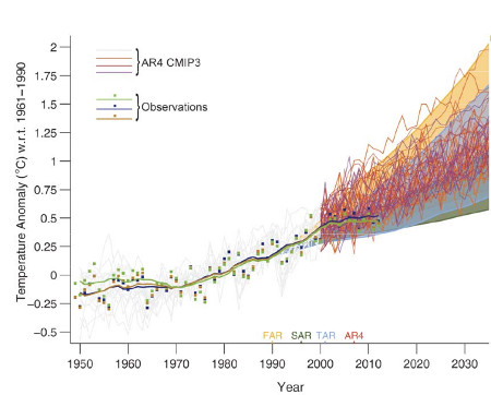
There's nothing wrong with the models. This chart shows that very well
IPCC AR5 Figure 1.4. Solid lines and squares represent measured average global surface temperature changes by NASA (blue), NOAA (yellow), and the UK Hadley Centre (green). The colored shading shows the projected range of surface warming in the IPCC First Assessment Report (FAR; yellow), Second (SAR; green), Third (TAR; blue), and Fourth (AR4; red).
Since 1990, global surface temperatures have warmed at a rate of about 0.15°C per decade, within the range of model projections of about 0.10 to 0.35°C per decade. As the IPCC notes,
"global climate models generally simulate global temperatures that compare well with observations over climate timescales ... The 1990â2012 data have been shown to be consistent with the [1990 IPCC report] projections, and not consistent with zero trend from 1990 ... the trend in globally-averaged surface temperatures falls within the range of the previous IPCC projections."
What about the Naysayers?
In the weeks and months leading up to the publication of the final 2013 IPCC report, there has been a flood of opinion articles in blogs and the mainstream media claiming that the models used by the IPCC have dramatically over-predicted global warming and thus are a failure. This narrative clearly conflicts with the IPCC model-data comparison figure shown above, so what's going on?
These mistaken climate contrarian articles have all suffered from some combination of the following errors.
1) Publicizing the flawed draft IPCC model-data comparison figure
Late last year, an early draft of the IPCC report was leaked, including the first draft version of the figure shown above. The first version of the graph had some flaws, including a significant one immediately noted by statistician and climate blogger Tamino.
"The flaw is this: all the series (both projections and observations) are aligned at 1990. But observations include random year-to-year fluctuations, whereas the projections do not because the average of multiple models averages those out ... the projections should be aligned to the value due to the existing trend in observations at 1990.
Aligning the projections with a single extra-hot year makes the projections seem too hot, so observations are too cool by comparison."
In the draft version of the IPCC figure, it was simply a visual illusion that the surface temperature data appeared to be warming less slowly than the model projections, even though the measured temperature trend fell within the range of model simulations. Obviously this mistake was subsequently corrected.
This illustrates why it's a bad idea to publicize material in draft form, which by definition is a work in progress. That didn't stop Fox News, Ross McKitrick in the Financial Post, Roger Pielke Jr., the Heartland Institute, and Anthony Watts from declaring premature and unwarranted victory on behalf of climate contrarians based on the faulty draft figure.
2) Ignoring the range of model simulations
A single model run simulates just one possible future climate outcome. In reality, there are an infinite number of possible outcomes, depending on how various factors like greenhouse gas emissions and natural climate variability change. This is why climate modelers don't make predictions; they make projections, which say in scenario 'x', the climate will change in 'y' fashion. The shaded regions in the IPCC figure represent the range of outcomes from all of these individual climate model simulations.
The IPCC also illustrates the "multi-model mean," which averages together all of the individual model simulation runs. This average makes for an easy comparison with the observational data; however, there's no reason to believe the climate will follow that average path, especially in the short-term. If natural factors act to amplify human-caused global surface warming, as they did in the 1990s, the climate is likely to warm faster than the model average in the short-term. If natural factors act to dampen global surface warming, as they have in the 2000s, the climate is likely to warm more slowly than the model average.
When many model simulations are averaged together, the random natural variability in the individual model runs cancel out, and the steady human-caused global warming trend remains left over. But in reality the climate behaves like a single model simulation run, not like the average of all model runs.
This is why it's important to retain the shaded range of individual model runs, unlike Bjorn Lomborg in The Australian, Judith Curry in The Australian, Benny Peiser at GWPF, Roger Pielke Jr., David Rose in the Mail on Sunday (copied by Hayley Dixon in The Telegraph), and Der Spiegel, all of whom only considered the model average.
This group all made an additional related third error as well.
3) Cherry Picking
Most claims that the IPCC models have failed are based on surface temperature changes over the past 15 years (1998â2012). During that period, temperatures have risen about 50 percent more slowly than the multi-model average, but have remained within the range of individual model simulation runs.
However, 1998 represented an abnormally hot year at the Earth's surface due to one of the strongest El Niño events of the 20th century. Thus it represents a poor choice of a starting date to analyze the surface warming trend (selectively choosing convenient start and/or end points is also known as 'cherry picking'). For example, we can select a different 15-year period, 1992â2006, and find a surface warming trend nearly 50 percent faster than the multi-model average, as statistician Tamino helpfully illustrates in the figure below.
Fast warming trend 1992â2006, slow warming trend 1997â2012
Global surface temperature data 1975â2012 from NASA with a linear trend (black), with trends for 1992â2006 (red) and 1998â2012 (blue).
In short, if David Rose wasn't declaring that global surface warming was accelerating out of control in 2006, then he has no business declaring that global surface warming has 'paused' in 2013. Both statements are equally wrong, based on cherry picking noisy short-term data.
IPCC models have been accurate
For 1992â2006, the natural variability of the climate amplified human-caused global surface warming, while it dampened the surface warming for 1997â2012. Over the full period, the overall warming rate has remained within the range of IPCC model projections, as the 2013 IPCC report notes.
"The long-term climate model simulations show a trend in global-mean surface temperature from 1951 to 2012 that agrees with the observed trend (very high confidence). There are, however, differences between simulated and observed trends over periods as short as 10 to 15 years (e.g., 1998 to 2012)."
The IPCC also notes that climate models have accurately simulated trends in extreme cold and heat, large-scale precipitation pattern changes, and ocean heat content (where most global warming goes). Models also now better simulate the Arctic sea ice decline, which they had previously dramatically underestimated.
All in all, the IPCC models do an impressive job accurately representing and projecting changes in the global climate, contrary to contrarian claims. In fact, the IPCC global surface warming projections have performed much better than predictions made by climate contrarians.
It's important to remember that weather predictions and climate predictions are very different. It's harder to predict the weather further into the future. With climate predictions, it's short-term variability (like unpredictable ocean cycles) that makes predictions difficult. They actually do better predicting climate changes several decades into the future, during which time the short-term fluctuations average out.
That's why climate models have a hard time predicting changes over 10â15 years, but do very well with predictions several decades into the future, as the IPCC illustrates. This is good news, because with climate change, it's these long-term changes we're worried about: