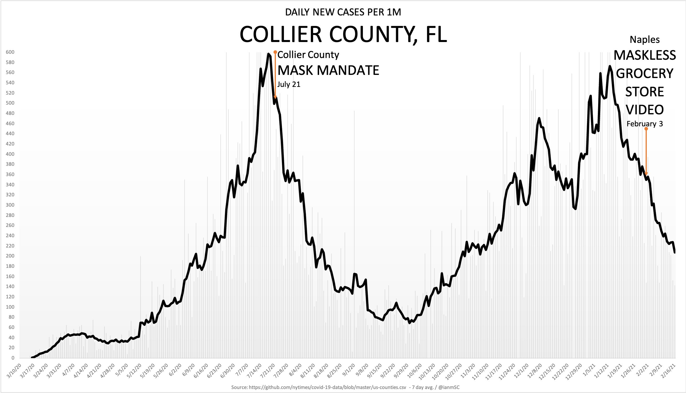
By the way, here is the original chart you claimed to be false (because you didn't understand the data). You quoted that
here:
Let's take a look at one of the many...
https://www.elitetrader.com/et/thre...den-stands-apart.342513/page-270#post-5336362
Your fabricated chart with fake data making claims about COVID in Collier County, Fl.
You say "one of the many", but this is the only chart you ever actually answered (because it is the only one you didn't understand). I will also admit to not understanding it, but because I have critical thinking skills, I figured out why it was
completely accurate.
Here is the original chart:
When you and I looked it up, we found that the data was a considerably lower on github and I admitted to not figuring it out. Of course, I thought more about it and realized that this chart is showing
Daily New Cases Per 1M pop.
However,
Collier County only has 384,902 people. Therefore, actual case count (
verified here in the NYT Website for Collier County, FL) would actually have to be
multiplied because the population is lower than 1M.
That takes this NYT chart:
And turns it into the one above - TO THE NUMBER.
So you're wrong about that one, too. Holy cow, you can't catch a break!
Happy to discuss if you want to come at me with why this calculation is incorrect. But you won't. I expect the same posts of emotion and no facts. Just the claim that "Facts dispute this" without the mentioning of any such facts.