You are using an out of date browser. It may not display this or other websites correctly.
You should upgrade or use an alternative browser.
You should upgrade or use an alternative browser.
Trend lines and Heisenberg's Uncertainty Principle
- Thread starter farmerjohn1324
- Start date
Here's another observation:
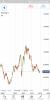
At too large of a timeline, trend lines become meaningless. Can you honestly draw any conclusions from this AUD/USD graph of last 20 years?
It's going up. Just draw the lines in yer head.
what meaning are you attaching to a trend?I'm stuck on wondering if any of these trends are actually real in the first place. And if any positive results would just be false positives.
it is movement in the same direction.......a movement of 5 ticks up is a trend.
of course that 5 ticks may be all illusion or Maya as my wise local country men have said.
is any thing real in any business.I'm stuck on wondering if any of these trends are actually real in the first place. And if any positive results would just be false positives.
is anything certain in any business
millions use TA.
95% lose but 5% win.
what does that tell you.what does that mean?
that 95% do not know how to use it.
it is apparent that you are one of those 95% who do not know how to use.
nothing to be ashamed of.
but that does not mean TA is mumbo jumbo that is a servant to only 5% of traders
is any thing real in any business.
is anything certain in any business
millions use TA.
95% lose but 5% win.
what does that tell you.what does that mean?
that 95% do not know how to use it.
it is apparent that you are one of those 95% who do not know how to use.
nothing to be ashamed of.
but that does not mean TA is mumbo jumbo that is a servant to only 5% of traders
Ease up. He's looking in from the outside, for the first time. I applied it to my trading from day one, and it still feels uncomfortable for me to accept. Then throw in nonsense that you see people promote. Just buy/sell MA, which works so perfectly on some youtube video, but the first time you go to do it, the market plays chop/chop with that number for the next three hours. Funny how I've never seen that happen to someone on youtube.
Last edited:

Not interesting, and probably not relevant. Are you a professor at a liberal university?Heisenberg's Uncertainty Principle says that the more precisely you measure somethings location, the less precisely you can measure it's velocity/momentum, etc.
Similarly, the more you zoom in on a chart, the less meaningful the trend lines are. On a tick chart, they're all but meaningless. You could "see" a clear trend on a 5-minute chart, only to zoom out to a week and see it as meaningless.
Now if you zoom out on a macro- scale, you can clearly see that the planet Saturn is moving at a certain speed and will continue to do so unless an outside force is applied (FA).
Thoughts?
")
Not interesting, and probably not relevant. Are you a professor at a liberal university?
No I'm not.