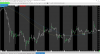
Below are two comparison charts, one for ninjatrader, the other for sierra chart.
Notice how low the resolution is on ninja is. Specifically look at the moving averages, and how blurry they are and in certain places, are almost transparent. Just awful.
Now compare to Sierra Chart. The moving averages are high resolution, crisp and clear. And the OHLC bars look perfect. Just the way they should look.
Attachments

Last edited:
 ) however I like hollow candlesticks and NinjaTrader doesn't offer them (I did find a solution, there is a ninjatrader add-on available for only $30!)