the bar itself.
To be fair, the radical right media did see fit to correct their spin.
the bar itself.
the bar itself.
What bar? There's no scale in the first chart, so it's hard to say what the hash marks represent. Anyone who has ever used Powerpoint and had a pain in the ass time with the scale function understands this.
If this is the best you two yambags have with "radical right wing media manipulation" then you're proving your desperation.
I think you might be the desperate one, Fox has already corrected their spin. It's over.
Correcting a powerpoint slide because it doesn't have a scale on the left axis isn't "spin". It's not like the numbers weren't provided on the first slide, thereby allowing anyone with an IQ over that of a carrot to do the math.
This excuse can also be applied to my supposed "selectivity" when it came to picking a gini coefficient chart. The numbers are provided.
You didn't provide all of the numbers. They did.
I didn't?
<img src="http://www.economicpopulist.org/files/u1/giniindex.jpg">
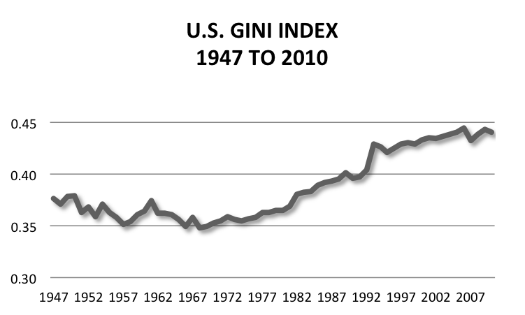
No, you didn't. You provided all the numbers in the date frame that made your case. From where the slope began an upwards trend.
The thing I like about your chart is how it shows the time when unionism was strong and our gini was falling.