
You are using an out of date browser. It may not display this or other websites correctly.
You should upgrade or use an alternative browser.
You should upgrade or use an alternative browser.
Neanderthals vs. "Science"
- Thread starter Tsing Tao
- Start date


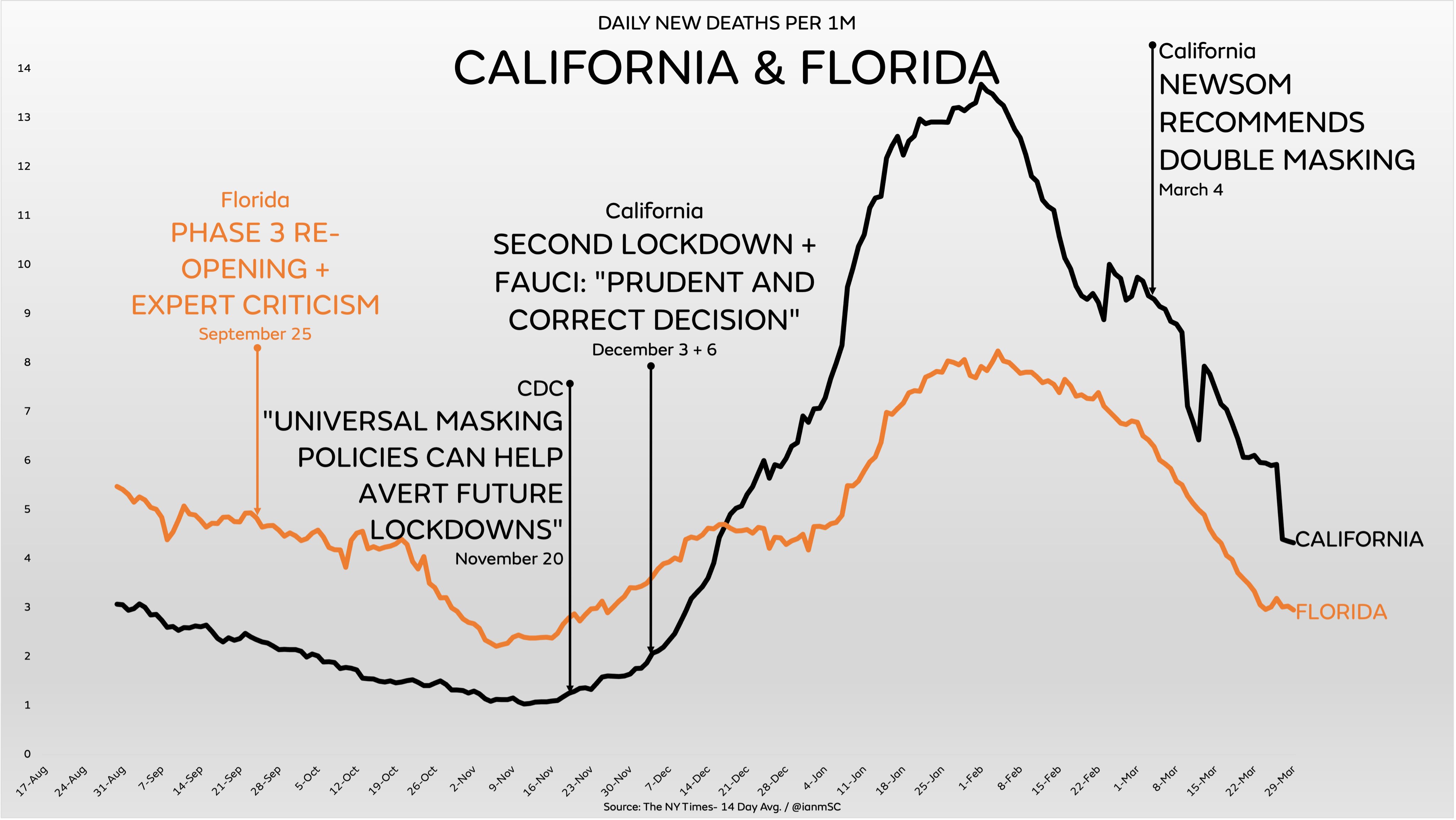
NY times 14 day average deaths per 1M.
Quotes easily found in google from government and news sources. Let me know if you need me to pull sources.
Enjoy the inane scriblings on your charts which are all about pushing COVID-denier political points -- which of course are provided without providing complete context of the situation. Very much in the same way you quote one mere paragraph in an article to promote your political points -- while ignoring all the rest of the paragraphs which provide the proper context.
Of course -- once again you don't provide the source url for these charts -- since we all know they come from rabid COVID-deniers (and anti-vaxxers) on Twitter.
It is long overdue for you to use reliable mainstream news sources for your information instead of conspiracy nonsense on Twitter and Blogs.
the ramblings of a sad fearful man... quoted below...
I can just seem him looking in the mirror
Masks work
Lockdowns work
dammit I am right instead of the data...
No matter what the data says...
I GWB am still a good person and I may lie my ass off for my cause because
its righteous and I am righteous.
I can just seem him looking in the mirror
Masks work
Lockdowns work
dammit I am right instead of the data...
No matter what the data says...
I GWB am still a good person and I may lie my ass off for my cause because
its righteous and I am righteous.
Enjoy the inane scriblings on your charts which are all about pushing COVID-denier political points -- which of course are provided without providing complete context of the situation. Very much in the same way you quote one mere paragraph in an article to promote your political points -- while ignoring all the rest of the paragraphs which provide the proper context.
Of course -- once again you don't provide the source url for these charts -- since we all know they come from rabid COVID-deniers (and anti-vaxxers) on Twitter.
It is long overdue for you to use reliable mainstream news sources for your information instead of conspiracy nonsense on Twitter and Blogs.
Take a look at the chart in this article :
https://time.com/5951512/2020-us-mortality-numbers/
We had numerous people on here trying to claim the US was full of false positives and that Covid was some sort of giant hoax. The chart clearly indicates a massive increase in deaths in the US in 2020. There have also been reports that the life expectancy of Americans actually dropped in 2020; that speaks directly to the false claims that it was just people that would have died anyways dying of Covid.
You can bs all you want making use of various hand picked charts that various Covid Deniers created. It's pointless, a ton of Americans died many needlessly because of poor community behavior and beliefs in bs. Some of you lost track of the bigger picture a long, long time ago.
But do keep posting pointless charts that speak about Mask Mandates and Surveys like any of that is important. You can win the internet as your fellow citizens drop dead in numbers far higher then they should be. Maybe you can go dine indoors or get your hair cut as your reward.
https://time.com/5951512/2020-us-mortality-numbers/
We had numerous people on here trying to claim the US was full of false positives and that Covid was some sort of giant hoax. The chart clearly indicates a massive increase in deaths in the US in 2020. There have also been reports that the life expectancy of Americans actually dropped in 2020; that speaks directly to the false claims that it was just people that would have died anyways dying of Covid.
You can bs all you want making use of various hand picked charts that various Covid Deniers created. It's pointless, a ton of Americans died many needlessly because of poor community behavior and beliefs in bs. Some of you lost track of the bigger picture a long, long time ago.
But do keep posting pointless charts that speak about Mask Mandates and Surveys like any of that is important. You can win the internet as your fellow citizens drop dead in numbers far higher then they should be. Maybe you can go dine indoors or get your hair cut as your reward.
Last edited:
the charts are for fun but what you wrote is
sophistry from a liberal moron.... see the nine morons quote below
I have seen no one denying Covid kills the sick... here on elitetrader. (i have not read every thread.)
Lets remember morons like your buddy were blaming the spread here in CA on people who were not wearing masks outdoors. There is no evidence of spread outdoors... plus 2 studies have shown they don't protect people.
so blaming the people is such a pre fascist thing to do....
where does the virus spread idiot...lets start there...
and then examine who it killed and how we could have better protected them.
you will see where the fault was.
sophistry from a liberal moron.... see the nine morons quote below
I have seen no one denying Covid kills the sick... here on elitetrader. (i have not read every thread.)
Lets remember morons like your buddy were blaming the spread here in CA on people who were not wearing masks outdoors. There is no evidence of spread outdoors... plus 2 studies have shown they don't protect people.
so blaming the people is such a pre fascist thing to do....
where does the virus spread idiot...lets start there...
and then examine who it killed and how we could have better protected them.
you will see where the fault was.
Take a look at the chart in this article :
https://time.com/5951512/2020-us-mortality-numbers/
We had numerous people on here trying to claim the US was full of false positives and that Covid was some sort of giant hoax. The chart clearly indicates a massive increase in deaths in the US in 2020. There have also been reports that the life expectancy of Americans actually dropped in 2020; that speaks directly to the false claims that it was just people that would have died anyways dying of Covid.
You can bs all you want making use of various hand picked charts that various Covid Deniers created. It's pointless, a ton of Americans died many needlessly because of poor community behavior and beliefs in bs. Some of you lost track of the bigger picture a long, long time ago.
But do keep posting pointless charts that speak about Mask Mandates and Surveys like any of that is important. You can win the internet as your fellow citizens drop dead in numbers far higher then they should be. Maybe you can go dine indoors or get your hair cut as your reward.
Last edited:
Enjoy the inane scriblings on your charts which are all about pushing COVID-denier political points -- which of course are provided without providing complete context of the situation. Very much in the same way you quote one mere paragraph in an article to promote your political points -- while ignoring all the rest of the paragraphs which provide the proper context.
Of course -- once again you don't provide the source url for these charts -- since we all know they come from rabid COVID-deniers (and anti-vaxxers) on Twitter.
It is long overdue for you to use reliable mainstream news sources for your information instead of conspiracy nonsense on Twitter and Blogs.
Every one of these charts - Every Single One - is verifiable throughout the media.
Sucks to be you, pushing a narrative so flimsy.
Take a look at the chart in this article :
https://time.com/5951512/2020-us-mortality-numbers/
We had numerous people on here trying to claim the US was full of false positives and that Covid was some sort of giant hoax. The chart clearly indicates a massive increase in deaths in the US in 2020. There have also been reports that the life expectancy of Americans actually dropped in 2020; that speaks directly to the false claims that it was just people that would have died anyways dying of Covid.
You can bs all you want making use of various hand picked charts that various Covid Deniers created. It's pointless, a ton of Americans died many needlessly because of poor community behavior and beliefs in bs. Some of you lost track of the bigger picture a long, long time ago.
But do keep posting pointless charts that speak about Mask Mandates and Surveys like any of that is important. You can win the internet as your fellow citizens drop dead in numbers far higher then they should be. Maybe you can go dine indoors or get your hair cut as your reward.
Hey, you're back! What's this, round three? Dude, make up your mind. On ignore, off ignore, on ignore, off ignore...
I'll keep posting charts that show readily verifiable facts. Like GWB, you can sulk that they don't show your fear mongering and scare-porn. But I really don't give a shit.
If you're going to be triggered so easily, put me back on ignore for the 4th time!
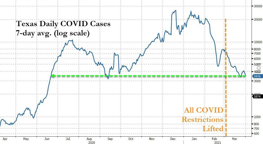
What happened then?
Well, in a development that would likely shock Dr. Fauci, newly confirmed Coronavirus cases in Texas plunged to their lowest since June, roughly three weeks after the state lifted its mask mandate and reopened businesses.
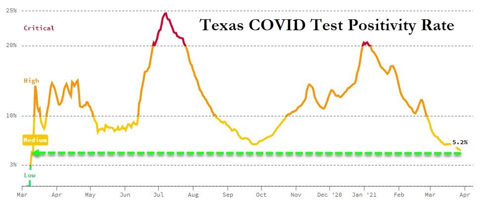
Source:
https://covidactnow.org/us/texas-tx/?s=1723645
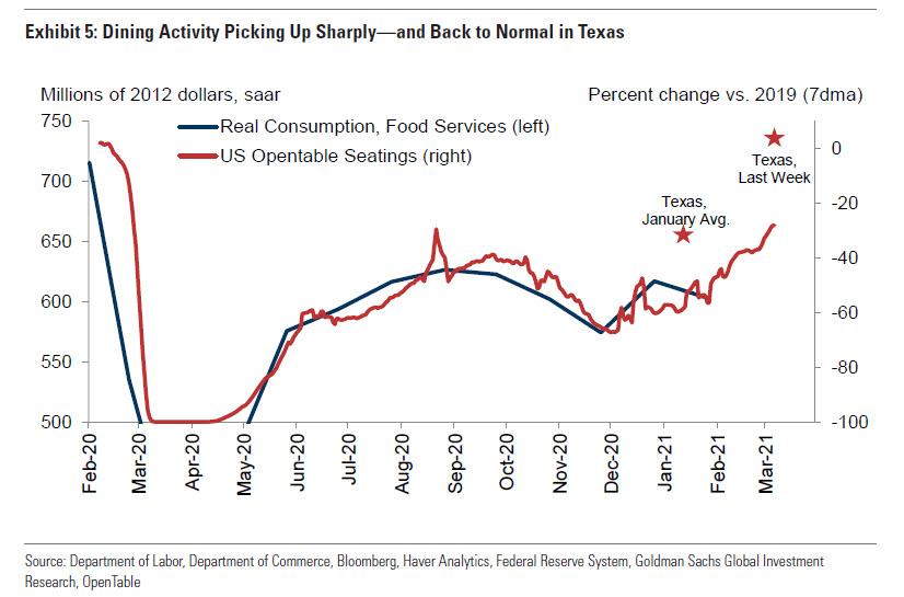
Meanwhile, as Newsweek notes, Mississippi also removed its COVID-19 restrictions around the same time. Like Texas, Mississippi has seen a drop in virus cases and hospitalizations. According to CDC data, as of Saturday Mississippi was seeing an average of 254 daily cases, which is a decrease from the previous month, where the state was averaging around 520.
According to the state's health department, Mississippi also saw a drop in COVID-19 hospitalizations, reporting 238 hospitalized patients with confirmed infections this past Friday, which is the lowest the state has seen since May.
Before the decreases in cases and hospitalizations in Texas and Mississippi, the two states received daily criticism for their coronavirus policies, including from Joe Biden's teleprompter. Shortly after both states said they were lifting their COVID-19 restrictions, Biden said, "The last thing we need is Neanderthal thinking, that, in the meantime, everything's fine, take off your mask, forget it. It still matters."
It appears that the Neanderthals were right, after all.