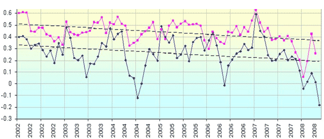
Here is a chart the save the earth crowd uses to make their point.

Looks like global temperatures have shot straight up since 1960, right? Let's scale out on the chart, back to 1880. The temperature peaked in 1940, predating the huge expansion in C02 emissions. That's odd.

I had the link saved to the article with these charts. I can't find it right now, but I'll post it later if I run across it on the web.
Looks like global temperatures have shot straight up since 1960, right? Let's scale out on the chart, back to 1880. The temperature peaked in 1940, predating the huge expansion in C02 emissions. That's odd.
I had the link saved to the article with these charts. I can't find it right now, but I'll post it later if I run across it on the web.