In the Coronavirus Fight in Scandinavia, Sweden Stands Apart

I'm going to have to take a trip to Carlsbad some day when I visit my land in the San Bernardino direction.

I'm wondering if his eyes point in different directions..

Any other obvious signs of a neurological condition or damage.

images (4).jpeg
 
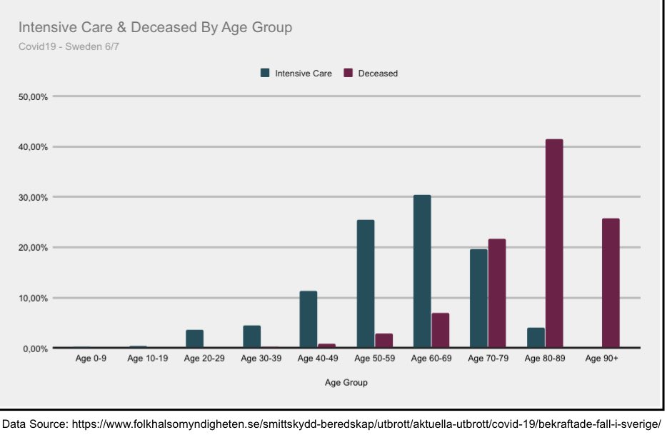
Some great graphs from the above thread. This is all on SWEDEN.

First, forecasted deaths to actual deaths. As usual, the forecast wasn't just off, but off by astronomical units.

EcTVw1sXYAAP1sJ


EcTVx9FX0AAqo_x


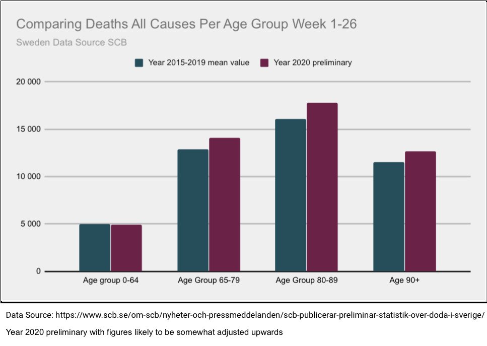
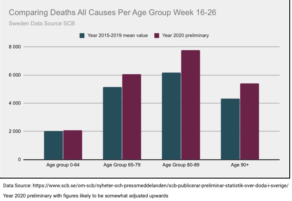
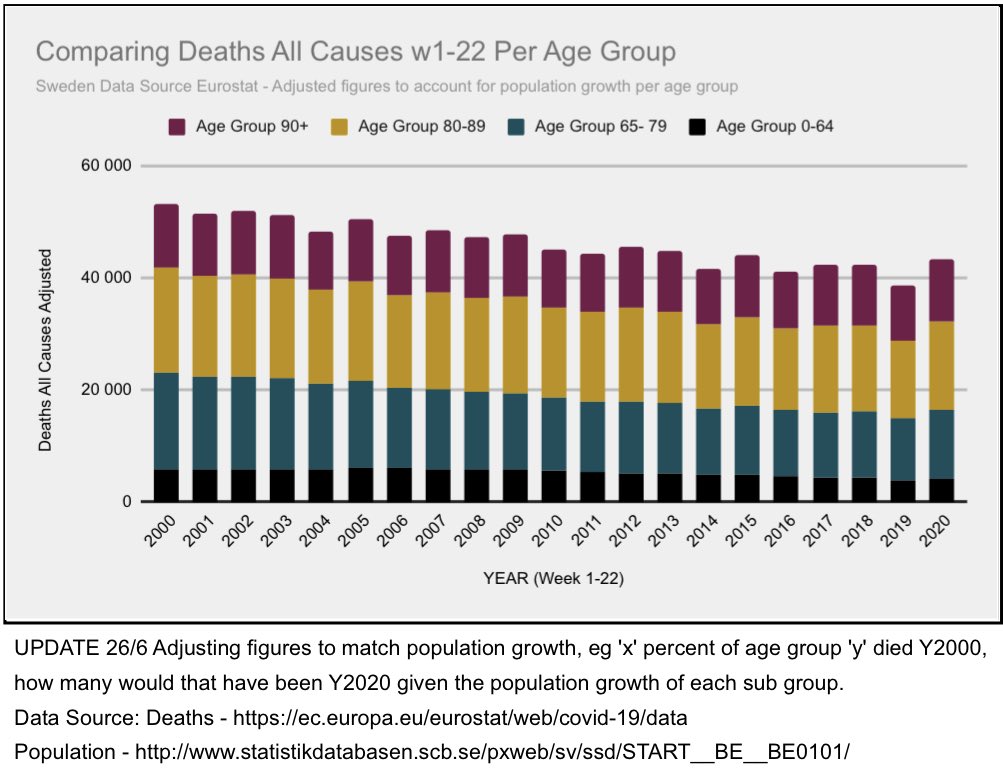
A good chart showing the number of deaths in a given year vs. this year. You can see how the number of deaths isn't all that different. It is elevated in higher age groups, but up to 64 years old, it is actually lower (most likely due to less auto accidents and the like).

EcTVyUBWAAAQ5rM


EcTVyT_XsAAElQL
 
  • Like
Reactions: jem
According to a study referenced in the thread, half of all home care patients died within two years of entering the home before the pandemic.

EcTVzgmXYAExNIQ


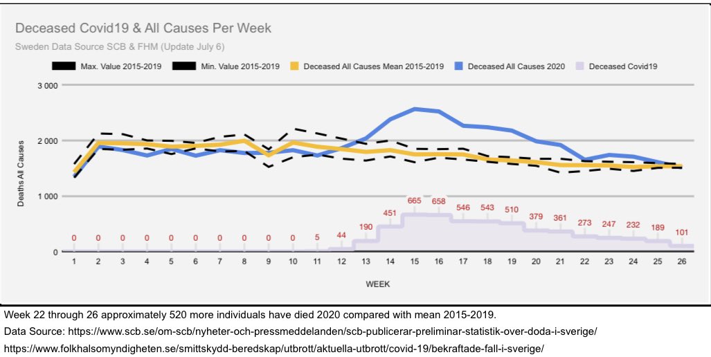
This chart shows why you can't use 2019 as a comparison of "all deaths by year" as a reference. It was an anomaly year.

EcTVz4aWoAInrXE


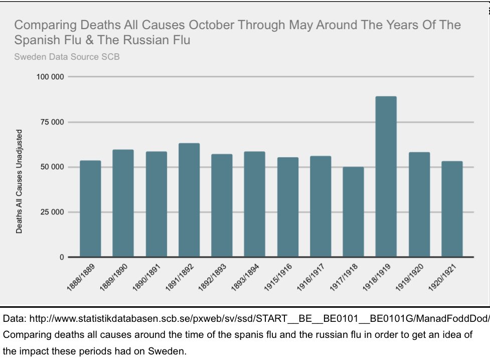
Deaths by previous pandemics in Sweden.

EcTV0RWWoAEmpBB
 
I will be happy to meet you at the beach area...

I doubt you are as much a dick in real life as you are here.

I will buy the first round of Guinness or coffee.


I'm going to have to take a trip to Carlsbad some day when I visit my land in the San Bernardino direction.

I'm wondering if his eyes point in different directions..

Any other obvious signs of a neurological condition or damage.

View attachment 232661
 
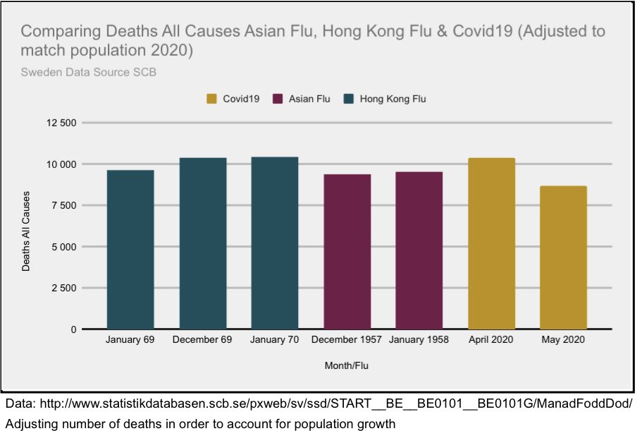
Population adjusted statistics by pandemic event.

EcTV0q3XQAAFUi8


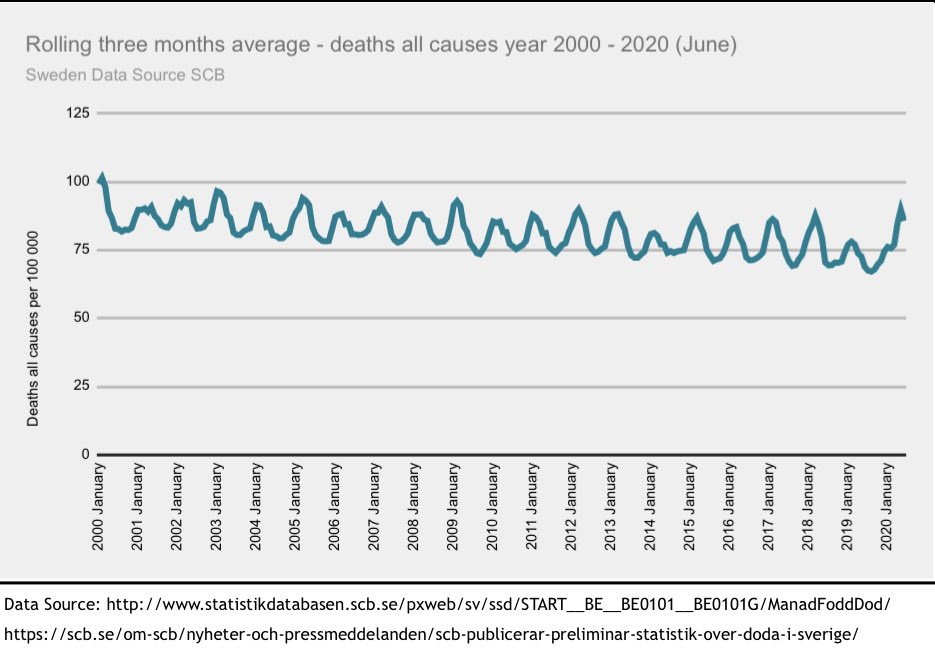
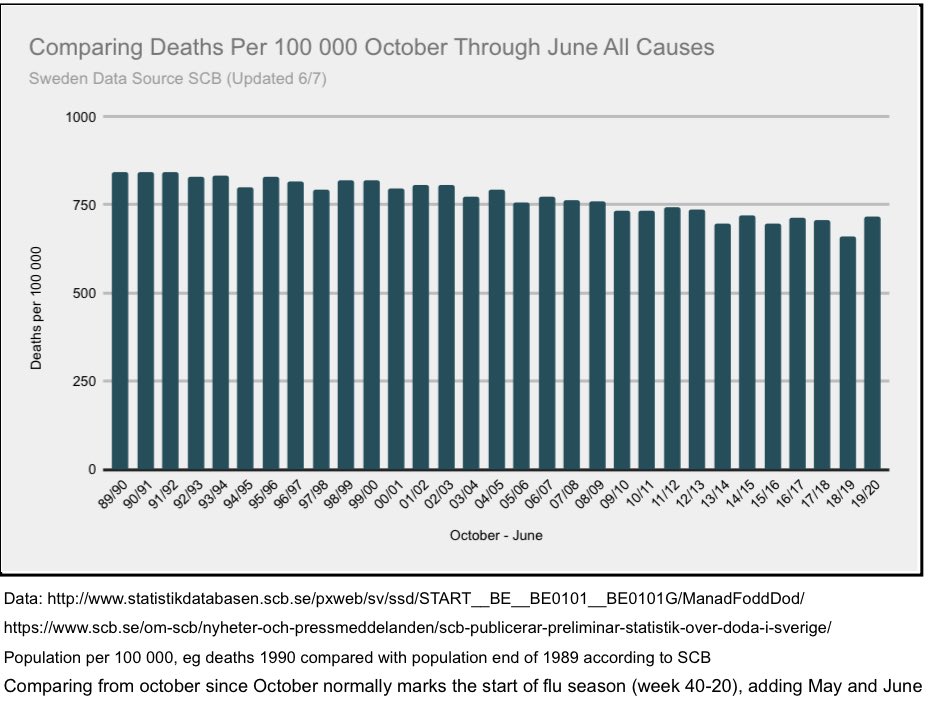
Deaths ALL Causes since 1990 per 100k pop. As you can see, this year was not worse than, and in many cases actually better than. OCT-JUNE (removes Q3)

EcTV1OmWsAE3kAs


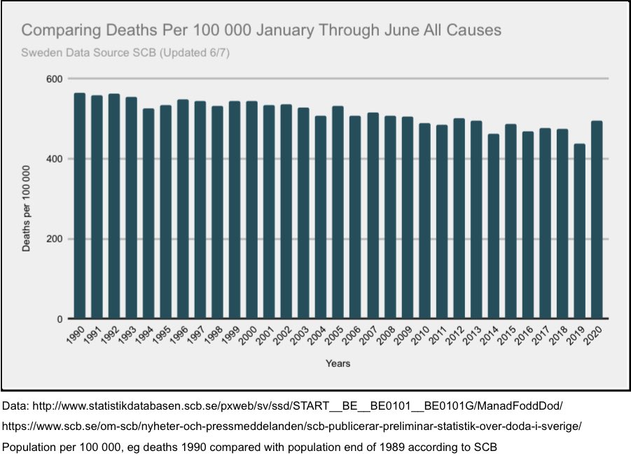
Same data as above chart, but only JAN-JUNE.

EcTV2BdWoAARgyI


Same chart, stratified by age.

EcTV2fCWAAElgoG
 
Why the lefties don't seem to understand the current significance of this...

I think... can be explained by intelligence or integrity.

Some don't have the intellect to appreciate what this chart signifies.
The others... I just don't understand their approach.


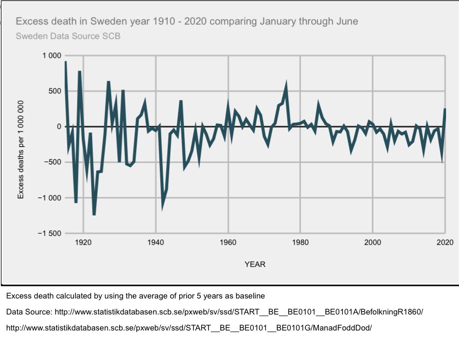
A great chart comparing Excess Deaths by year. Sure does destroy some narratives, eh?

EcTV7snX0AAIsAB


EcTV8D2WAAAEc9e
 
Why the lefties don't seem to understand the current significance of this...

I think... can be explained by intelligence or integrity.

Some don't have the intellect to appreciate what this chart signifies.
The others... I just don't understand.

My biggest and really only point here is to show that we should not have destroyed the economy (further - lets face it, the economy already sucked from years of Fed and Federal mismanagement) over this virus. We reacted poorly and on poor data. Sweden didn't. They made the right call.
 
  • Like
Reactions: jem
I will be happy to meet you at the beach area...

I doubt you are as much a dick in real life as you are here.

I will buy the first round of Guinness or coffee.

I have a slightly better than proportional dick but beach or elsewhere, you would not be be gazing on it.

Get an MRI scan, maybe there is a paperclip went up your nostril causing a short?

I do agree however that intelligence and integrity explains why you can't get normal people to agree with your ideas.
 
Back
Top