the volume also can be used to see if the current price is good for sellers or buyers. the volume dots on Bookmap shows it and in that case it can give more certainty for a reversal.Thats what i mean; that kind of volume gets in the way of price when i try to print the chart;
You are using an out of date browser. It may not display this or other websites correctly.
You should upgrade or use an alternative browser.
You should upgrade or use an alternative browser.
Identifying a reversal (trend change)
- Thread starter Alfing
- Start date
The issue is at what price people will want to buy or sell, and that is what creating the reversal.
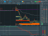
Bookmap shows the price range were there is an exhaustion of buyers or sellers, which can reflect a shift in the trend.
AH! I took another look at your posted graphic(s), and it seems as if the colored pie-chart dots (divided on an implicit horizontal basis) are derived from DOM cumulative orders on Bid and Ask.
• As hedging pushes orders in the perceived market direction (say, on the ASK when the market anticipates a climb), the dot grows more green. As total order volume grows, the dot grows bigger as well. Cumulative order volume has been a handy but way under-popularized DOM-level indicator for quite some time.
• But with either of HFT or iceberg orders, the usefulness of the DOM itself has been eroded -- making even use of cumulative BID/ASK orders a dicey proposition.
I *happen* to be more of a numbers guy, at DOM-level trading, so I'd want to see what the numbers were, not dots on a screen. But a handy thing about the dots-graphic is that they remain over time -- you could even throw a MA in there, to steady things out (and discern larger trading/traders' agendas?!?) -- things that do not remain available when working just numbers off the DOM.
Hmmmmm. (This is where having one of those little emoji things of the hand thoughtfully rubbing the chin comes in...)
%%the volume also can be used to see if the current price is good for sellers or buyers. the volume dots on Bookmap shows it and in that case it can give more certainty for a reversal.
I like the dots on PSAR[parabolic stop + reVerse]+ like the lagging moving averages, they underline or overline price.Even though PSAR tends to lag to much
 , LOL
, LOLI've found that when you're analyzing trend the longer time frames are your friend. (and btw, oscillators like the RSI [and wave counts] have been Armageddon for the past ten years, too) How many false exhaustion Elliot Waves have there been the past ten years ? How many false overbought oscillators ?
I hear everybody talk about the "top" - but nobody talk about the much bigger technical story of the past decade; the trendline bottom that has been in place for the past ten years.

I hear everybody talk about the "top" - but nobody talk about the much bigger technical story of the past decade; the trendline bottom that has been in place for the past ten years.
Last edited:
Our education in conventional subjects and our subsequent exposure to the media prevents us seeing what is the real picture. We are educated to seek out the errors in our work and to focus on eliminating them, to identify our weaknesses and work on them, to find the smoking gun and deduce everything that happened from one tiny esoteric clue. The media always seek the opposing point of view - doesn't matter if there are 1000 people chanting for something, they will want to interview the one guy who's against it. Success in a professional career comes from knowing more and more about less and less.
This permeates our ways of thinking about and resolving issues.
I never short the Dow.
This permeates our ways of thinking about and resolving issues.
I never short the Dow.
%%I've found that when you're analyzing trend the longer time frames are your friend. (and btw, oscillators like the RSI [and wave counts] have been Armageddon for the past ten years, too) How many false exhaustion Elliot Waves have there been the past ten years ? How many false overbought oscillators ?
I hear everybody talk about the "top" - but nobody talk about the much bigger technical story of the past decade; the trendline bottom that has been in place for the past ten years.
LOL Easy to find a top in SPY,QQQ ,uptrending bullmarket makes anew top about every month .LOL. Of course QQQ went down about>> 80% 0ff bear of 2000, 2001, 2002...…………….………………………………………………………………………………………………...
%%
LOL Easy to find a top in SPY,QQQ ,uptrending bullmarket makes anew top about every month .LOL. Of course QQQ went down about>> 80% 0ff bear of 2000, 2001, 2002...…………….………………………………………………………………………………………………...
The damage that was done in December 2018 didn’t have any follow through. Any legitimate sell signals generated in December 18 were reversed in Jan 19. Commercial paper is chasing yield and their averaged price is considerably lower than current valuations - they’ve been at it since 2009 or so.
%%True;The damage that was done in December 2018 didn’t have any follow through. Any legitimate sell signals generated in December 18 were reversed in Jan 19. Commercial paper is chasing yield and their averaged price is considerably lower than current valuations - they’ve been at it since 2009 or so.
+ prelection years like 2019 tend to be superstrong.Having said that; I usually like some QQQ + related= but not this year/summer.No where is it written I enjoy drawdowns.LOL.
NOT a prediction. not long TSLA...……………………………………………………………………………………………………………………………………………………………...
You right.AH! I took another look at your posted graphic(s), and it seems as if the colored pie-chart dots (divided on an implicit horizontal basis) are derived from DOM cumulative orders on Bid and Ask.
• As hedging pushes orders in the perceived market direction (say, on the ASK when the market anticipates a climb), the dot grows more green. As total order volume grows, the dot grows bigger as well. Cumulative order volume has been a handy but way under-popularized DOM-level indicator for quite some time.
• But with either of HFT or iceberg orders, the usefulness of the DOM itself has been eroded -- making even use of cumulative BID/ASK orders a dicey proposition.
I *happen* to be more of a numbers guy, at DOM-level trading, so I'd want to see what the numbers were, not dots on a screen. But a handy thing about the dots-graphic is that they remain over time -- you could even throw a MA in there, to steady things out (and discern larger trading/traders' agendas?!?) -- things that do not remain available when working just numbers off the DOM.
Hmmmmm. (This is where having one of those little emoji things of the hand thoughtfully rubbing the chin comes in...)
Traditional DOM can be added to screen also. I'm trading stocks and just starting to trade futures- because I found the Bookmap software- so I'm not so familier with the traditional DOM.
I'm not familiar with PSAR. Also english is not my native thoungh, so what doyou mean by 'lag'?%%
I like the dots on PSAR[parabolic stop + reVerse]+ like the lagging moving averages, they underline or overline price.Even though PSAR tends to lag to much