
You are using an out of date browser. It may not display this or other websites correctly.
You should upgrade or use an alternative browser.
You should upgrade or use an alternative browser.
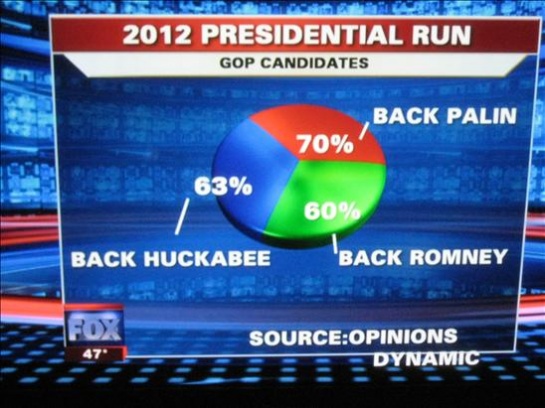
FOXNews - Best Pie Chart Ever
- Thread starter Covertibility
- Start date
Simple jokes for simple minds.
What was the context of the question professor?
What was the context of the question professor?

Wow...they must have polled all "57" states that obama went to to get those numbers.
<object width="425" height="344"><param name="movie" value="http://www.youtube.com/v/EpGH02DtIws&hl=en_US&fs=1&"></param><param name="allowFullScreen" value="true"></param><param name="allowscriptaccess" value="always"></param><embed src="http://www.youtube.com/v/EpGH02DtIws&hl=en_US&fs=1&" type="application/x-shockwave-flash" allowscriptaccess="always" allowfullscreen="true" width="425" height="344"></embed></object>
<object width="425" height="344"><param name="movie" value="http://www.youtube.com/v/EpGH02DtIws&hl=en_US&fs=1&"></param><param name="allowFullScreen" value="true"></param><param name="allowscriptaccess" value="always"></param><embed src="http://www.youtube.com/v/EpGH02DtIws&hl=en_US&fs=1&" type="application/x-shockwave-flash" allowscriptaccess="always" allowfullscreen="true" width="425" height="344"></embed></object>
A liberal's view of the "pie in the sky" ...
Perhaps, Fox was trying to broaden their viewership

Perhaps, Fox was trying to broaden their viewership
Quote from John_Wensink:
Does the pie chart represent 100% or perhaps was there a series of questions that each individual slice represent 100%?
Do not be fooled by liberal lies.
come on dude, Fox fudged up, ...
these idiots wish to make it a test of Fox's credibility, while they still defend the other idiots at CRU.
you're correct on one account, these people are idiots
Quote from Mr. Rogers of Mr. Rodger's Neighborhood:
"Okay boys and girls, welcome to my neighborhood. You know it happens so often with the right wing. Today we are going to talk about straw man fallacies. For example look at the straw man fallacy below."
"Okay boys and girls, welcome to my neighborhood. You know it happens so often with the right wing. Today we are going to talk about straw man fallacies. For example look at the straw man fallacy below."
Quote from peilthetraveler:
Wow...they must have polled all "57" states that obama went to to get those numbers.
<object width="425" height="344"><param name="movie" value="http://www.youtube.com/v/EpGH02DtIws&hl=en_US&fs=1&"></param><param name="allowFullScreen" value="true"></param><param name="allowscriptaccess" value="always"></param><embed src="http://www.youtube.com/v/EpGH02DtIws&hl=en_US&fs=1&" type="application/x-shockwave-flash" allowscriptaccess="always" allowfullscreen="true" width="425" height="344"></embed></object>
Quote from John_Wensink:
Does the pie chart represent 100% or perhaps was there a series of questions that each individual slice represent 100%?
Do not be fooled by liberal lies.
Hi John,
if that was the case then they should've made it as a bar histogram for example rather than a pie.
Secondly, they made it a a percentage. If it is a percentage, then no matter how you cut it, the people they interviewed, who answered the same set of questions, represent a hundred percent regardless of their number.
Regards,
Sameeh