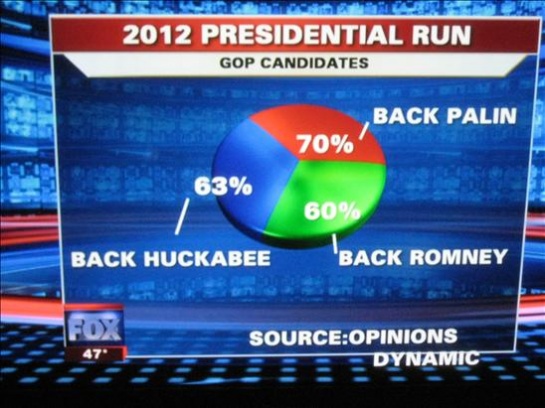
Nothing really changes, the original Limbaugh/Palin/Beck supporters showing that new math back in the day
<object width="425" height="344"><param name="movie" value="http://www.youtube.com/v/MRiTzrIS5fo&hl=en_US&fs=1&"></param><param name="allowFullScreen" value="true"></param><param name="allowscriptaccess" value="always"></param><embed src="http://www.youtube.com/v/MRiTzrIS5fo&hl=en_US&fs=1&" type="application/x-shockwave-flash" allowscriptaccess="always" allowfullscreen="true" width="425" height="344"></embed></object>
<object width="425" height="344"><param name="movie" value="http://www.youtube.com/v/MRiTzrIS5fo&hl=en_US&fs=1&"></param><param name="allowFullScreen" value="true"></param><param name="allowscriptaccess" value="always"></param><embed src="http://www.youtube.com/v/MRiTzrIS5fo&hl=en_US&fs=1&" type="application/x-shockwave-flash" allowscriptaccess="always" allowfullscreen="true" width="425" height="344"></embed></object>