Alright.
So first, lets get the worldmeters update out of the way. I'm starting with this site since these are the charts everyone typically sees in the media, and the data referenced within.
Florida cases and deaths as of today, reported on the worldmeters site. Remember, the Worldmeters site lists deaths on the day they were
reported, not the day they occur. Additionally, deaths do not just contained
confirmed cases of Covid that terminated, but
probable cases.
From the
Worldmeters site itself:
Following new CDC guidelines: "As of April 14, 2020, CDC case counts and death counts include both confirmed and probable cases and deaths
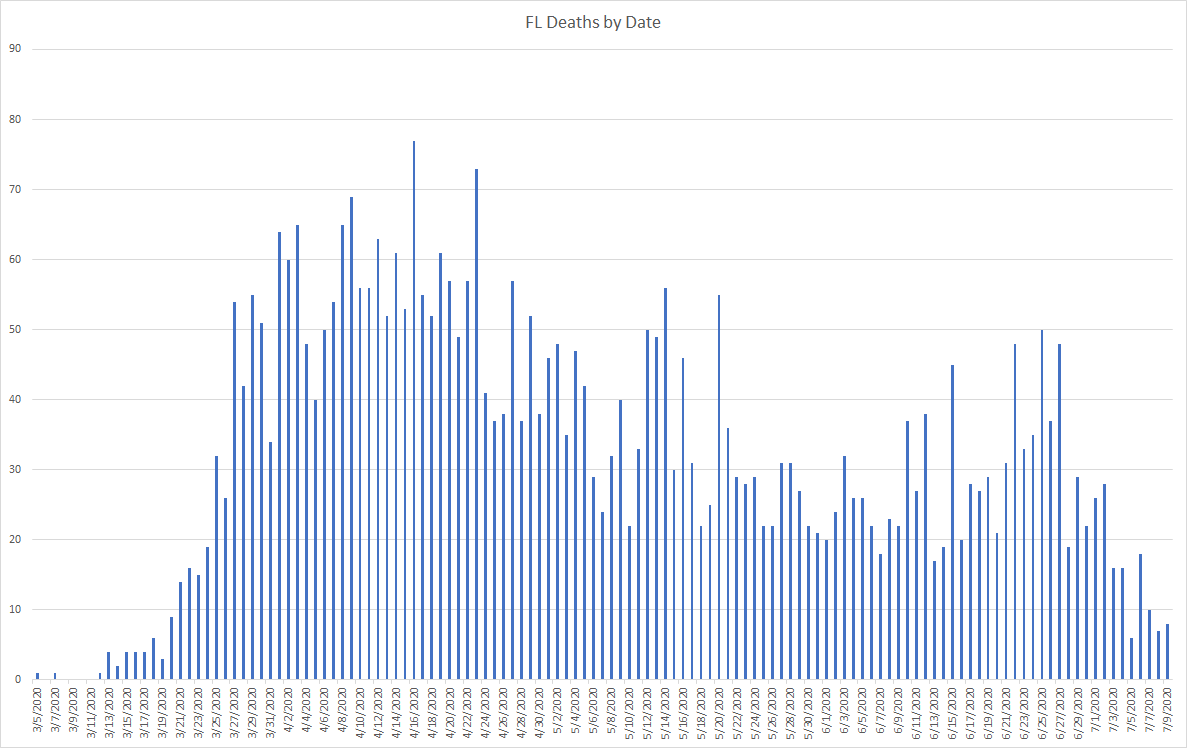
Case count continues to post record cases tested positive.
Then there are the deaths as
reported. Remember, these aren't the deaths on the days the people actually died. Just when the reporting came through.
This graph by itself would give cause to be worried - any sane person would look at that and go "holy crap, we're finally seeing the spike." Except that, when you dig into it, we really aren't. Of the 119 deaths that were
reported on July 9, actually
three occurred in July. You read correctly. 3. I don't have that number yet for July 10 which shows 93 deaths
reported on July 10. My numbers are as of yesterday, so I can only speak to those. But it is clear which way the trend goes.
Why the delay??
As this graph illustrates, there is a sometimes very lengthy process in getting data to the CDC for reporting purposes. Now, not all sites source from the CDC, so that doesn't explain the delay on sites like Worldmeters, the reporting methodology explains that (posting it on the day reported vs. the day it occurred).
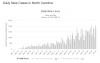
Because I don't want to get into an argument on the Florida portal about the data being manipulated, lets look at gwb's home state of North Carolina (which also has a dashboard, and a really good one). First, this is the Worldmeter's site:
On July 9th, 23 deaths were reported on the worldmeters site in North Carolina. But only 1 occurred on that day. How do I know this? Because the
North Carolina dashboard shows it:
Can't blame this on some crackpot DeSantis manipulation theory.
But it sure tells a different story, doesn't it? Looks like deaths are making a decline in NC, as case counts are rising.
Just like Florida.
One more thing on case counts for North Carolina because the graphs are so stark and then we will get back to Florida. Here is the Worldmeter's case count for North Carolina.
Looks pretty bad, doesn't it. 7 day M/A is getting worse and, as our pal Suntrader likes to tell us, its all about the 7 day MA. In fact, yesterday I pointed this chart out to gwb and he agreed, it was getting worse in NC. Problem is, I was wrong. For the same reason on the deaths. Cases on the Worldmeters site show when the case was reported. Not when the specimen was collected. In fact, if I go to the NC portal and ask for the same data (by reported), I get a very similar picture.
But lucky for us, NC has a cool little feature that lets us see case counts by when the
specimen was actually collected!
Would ya look at that!! NC doesn't look all that bad after all, does it? Especially when you consider NC Testing is still going strong:
So if you were to believe the media articles, you'd want to slit your wrists. But the truth, as they say, shall set you free.
I'll continue in the next post as images have a limit per post.