Quote from Martinghoul:
Howz about I redirect you at a nice blog post that sums things up nicely? As you know, I am a big fan of Calculated Risk, so here's something that Bill McBride published at the beginning of this year:
http://www.calculatedriskblog.com/2013/01/the-futures-so-bright.html
Generally, there's a wealth of data that CR follows and some of it is less mainstream. I highly recommend it.
Great, let's look at the article, published back in January.
Quote from Calculated Risk:
It looks like economic growth will pickup over the next few years. I've written about this before - a combination of growth in the key housing sector, a significant amount of household deleveraging behind us, the end of the drag from state and local government layoffs (four years of austerity nearing the end), some loosening of household credit, and the Fed staying accommodative (with a 7.8% unemployment rate and inflation below the Fed's target, the Fed will remain accommodative).
The key short term risk is too much additional deficit reduction too quickly. There is a strong argument that the "fiscal agreement" might be a little too much with the current unemployment rate - my initial estimate was that Federal government austerity would subtract about 1.5 percentage points from growth in 2013 (Merrill Lynch estimate up to 2.0 percentage points including an estimate for the coming sequester agreement). This means another year of sluggish growth, even with an improved private sector (retail will be impacted by the payroll tax increase). But ex-austerity, we'd probably be looking at a decent year.
Ok, opening statement in which the author claims the future looks like it will be a good one, with economic activity looking like it will pick up. We'll get to the data when he gets to the chart, but I do note two important aspects here. First, he's talking about
fiscal policy and the resulting austerity impacting macro economics, not
monetary policy. It's important to remember, we're talking the Fed and QE, and it's impact to the economy, and what we think is getting better in order for the Fed to pull back QE (because, as you stated, you don't believe QE3 is good, but all the other QEs were).
The second interesting comment is that he says "ex-austerity, we'd probably be looking at a decent year." So we're still not at the level of decent, ok. Gotcha. Hopium, and all that. I'm tracking now.
Quote from Calculated Risk:
This graph shows total and single family housing starts. Even after the 28.1% in 2012, the 780 thousand housing starts in 2012 were the fourth lowest on an annual basis since the Census Bureau started tracking starts in 1959. Starts averaged 1.5 million per year from 1959 through 2000. Demographics and household formation suggests starts will return to close to that level over the next few years. That means starts will come close to doubling from the 2012 level.
Residential investment and housing starts are usually the best leading indicator for economy, so this suggests the economy will continue to grow over the next couple of years.
Oook. So housing starts are the fourth lowest since 1959, but again, we're looking for them to pick up. We're hoping, k? After all, here's how NAHB future sales expectations have worked out so well in the past...
Quote from Calculated Risk:
The second graph shows total state and government payroll employment since January 2007. State and local governments lost 129,000 jobs in 2009, 262,000 in 2010, and 230,000 in 2011. In 2012, state and local government employment declined by 26,000 jobs.
Note: The dashed line shows an estimate including the benchmark revision.
It appears most of the state and local government layoffs are over. Some states like California are close to running a surplus, and, as the BLS reported this morning, even Nevada is seeing a sharp improvement in the unemployment rate.
So
government job layoffs
appear to be over based on California, Nevada, and the fact that government jobs declined by only 26,000 jobs in all of 2012,
before the sequester was put into effect. I see. Never mind about that pesky private payroll information, the unemployment rate (the U-6, of course, not the convenient U3) and the Labor force participation rate. Also ignore that all jobs being put out there are now part time instead of full time, and that Obamacare will be driving this to be the norm in the future as people attempt to get under the hours-per-week mandate to drive health insurance. I can offer links on any of this if you question it's validity. Just say the word.
Quote from Calculated Risk:
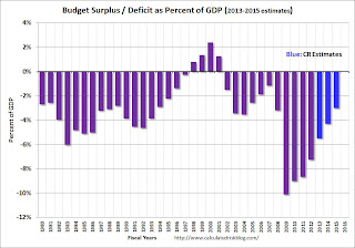
And another key graph on the US deficit. As we've been discussing, the US deficit as a percent of GDP has been declining, and will probably decline to around 3% in fiscal 2015.
This graph shows the actual (purple) budget deficit each year as a percent of GDP, and an estimate for the next three years based on current policy (Jan Hatzius at Goldman Sachs estimates the deficit will 3% of GDP in 2015). Note: With 7.8% unemployment, there is a strong argument for less deficit reduction in the short term, but that doesn't seem to be getting any traction.
Let's
hope (there's that word again) it continues to decline, though a lot of that will have to do with debt ceiling negotiations this coming September. The US still has no budget (the senate hasn't passed one in years) and the belief that deficit to GDP will lower is partly predicated on lofty GDP estimates, and on a sequester which has cut spending (albeit by a little amount) and is harming GDP on it's own merit (which I will not argue).
WTF.
Calculated Risk then goes into how there has been a slight decrease in mortgage debt and it would appear consumers are firming up their balance sheets. Riiight. Student loans. 10 year car loans. FHA no money down houses. ARMs on the rise. People living for free as banks refuse to foreclose. Yeah, we're doing lovely.
The last paragraph talks about the longer term, admitting there are serious problems that need to address, but in the short term, it "looks" (hopes/seems/probably/maybe/should be) getting better. But no real data to support any of that.
And my one chart regarding QE and the economy getting better:
Your serve.