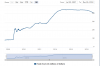
As a side note, I wanted to mention that the above chart you posted is certainly an eye-opener when you draw basic lines. Knowing the numbers in the head is one thing, but seeing it on a chart brings it into contrast.
The red line is what the chart would look like if it fell in the same percentage of 50% of 2007-2008, were it to unfold now. With the little up and down bars painted in of course. Very scary looking.
Odd timing when you think about it...That it could be happening now, after the YM is almost exactly double the point-number peak (27,000), within a very small percentage, of the previous peak in late 2007 (14,000).