Correct. What's funny is that the SLA approach usually tells me how far a move will go but I usually bail out too soon. I'm having a hard time forgetting about my early trading disasters...when I had no plan.From reading some of your other posts, you seem to still have issues with holding or am I misunderstanding?

You are using an out of date browser. It may not display this or other websites correctly.
You should upgrade or use an alternative browser.
You should upgrade or use an alternative browser.
switching gears to Price Action via SLA
- Thread starter gears
- Start date
I think you had initially written something about there not being a trend and I was quite confused.If it breaks out of the range and begins to trend, then you may have some retracements to trade. Otherwise, not.

Today was pretty sweet for me and this entry might be rather long. I didn’t sleep well so I decided before I even got in front of my computer that it was going to be an observation day. And with that in mind, I didn’t watch the chart so much as I did my trading dom. I know that watching the right tick is a tremendous way to decipher the nature of “who’s in charge” and I’ve been struggling with that in just watching as a 1min bar prints. Seeing the nature of swift movement up and times when it seems that a particular price doesn’t even have much interest was relatively easy to see when watching the dom. Seeing it that way also completely demonstrates that for every transaction, there’s a buyer and a seller. Not that I didn’t already know that, but it was drilled into my head more by viewing price movement this way and really seeing the buy and sell columns on both sides of price.
Yesterday it was suggested that I may not know how to identify a range. I believe I do, but when looking at some areas I’ve marked on my chart compared to Db’s chart (House journal), there are some differences.
Longer term areas where pauses occurred are important, but Db’s recent comment about taking the most recent activity (duh for gears) into the equation has been rather eye opening. So yes, I had the high and low marked from the 60min timeframe of the EOD yesterday/overnight (blue dashed lines), but I also looked more closely at the 15min timeframe to see a different view of price.
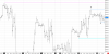
From the 15min view, I saw 4206 to 4214 as the range. Mathematically, 4210 is the middle of that and not surprisingly that’s where a lot of activity occurred. There were some movements outside each of those areas (most notably at 0530), but for much of the overnight, price hung out in that area. Price did start to trend downward when the upper area wasn’t as popular from 0700 onward.
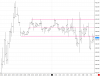
So right out of the gate, price headed up to the 4210 area - the midpoint of the overnight range area I’d identified. Couldn’t hold there and headed back south to the overnight low area. Another trek up and couldn’t make it as far as the last time - back down.
A - Definitive print of price and then shot up like a cannon.
B - Price got back up to 4214 area, but fell down like a house of cards.
C - My analogy for this is that a football was snapped and a running back took off down field. Not only did the defensive line stop the movement after forward progress was made, but they picked his ass up and brought him all the way back to the line of scrimmage. That’s how price moved there - movement up, but "hell no - not right now" movement back.
D - Overall, 4203-4206 was a hugely popular price point earlier this morning. Value was found in that area and when that area was encountered, price movement slowed down. A few ticks up or down, but price would often come back there. It was watching that movement that the idea of “home” of the midpoint made more sense. I’ve often taken the extreme areas and tried to calculate the middle by them - and it works. But the notion of a middle being there and traders venturing to and from it makes more sense. I’ve been looking at it backwards.
E - After handing out around 4200, price cascaded down, but only hung out there for a short time and then started marching back up.
Obviously I’m still missing some of the puzzle pieces with regard to levels and movement, and unfortunately, I’m not sure how to correct my thought process at this time. Comments or suggestions?
Yesterday it was suggested that I may not know how to identify a range. I believe I do, but when looking at some areas I’ve marked on my chart compared to Db’s chart (House journal), there are some differences.
Longer term areas where pauses occurred are important, but Db’s recent comment about taking the most recent activity (duh for gears) into the equation has been rather eye opening. So yes, I had the high and low marked from the 60min timeframe of the EOD yesterday/overnight (blue dashed lines), but I also looked more closely at the 15min timeframe to see a different view of price.
From the 15min view, I saw 4206 to 4214 as the range. Mathematically, 4210 is the middle of that and not surprisingly that’s where a lot of activity occurred. There were some movements outside each of those areas (most notably at 0530), but for much of the overnight, price hung out in that area. Price did start to trend downward when the upper area wasn’t as popular from 0700 onward.
So right out of the gate, price headed up to the 4210 area - the midpoint of the overnight range area I’d identified. Couldn’t hold there and headed back south to the overnight low area. Another trek up and couldn’t make it as far as the last time - back down.
A - Definitive print of price and then shot up like a cannon.
B - Price got back up to 4214 area, but fell down like a house of cards.
C - My analogy for this is that a football was snapped and a running back took off down field. Not only did the defensive line stop the movement after forward progress was made, but they picked his ass up and brought him all the way back to the line of scrimmage. That’s how price moved there - movement up, but "hell no - not right now" movement back.
D - Overall, 4203-4206 was a hugely popular price point earlier this morning. Value was found in that area and when that area was encountered, price movement slowed down. A few ticks up or down, but price would often come back there. It was watching that movement that the idea of “home” of the midpoint made more sense. I’ve often taken the extreme areas and tried to calculate the middle by them - and it works. But the notion of a middle being there and traders venturing to and from it makes more sense. I’ve been looking at it backwards.
E - After handing out around 4200, price cascaded down, but only hung out there for a short time and then started marching back up.
Obviously I’m still missing some of the puzzle pieces with regard to levels and movement, and unfortunately, I’m not sure how to correct my thought process at this time. Comments or suggestions?
So today I took two sim trades, but had mediocre results so I decided to sit back and watch. In general, I think my exits were reasonable/justified, so I’m not displeased with my efforts. I do wish I’d entered earlier on the first one, but the movement felt more like REJ to me so obviously I’ve still got to do some more observing. I do recall NoDoji making a comment about so often entering when it almost seems counterintuitive to do so.
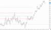
So overnight, price had been steadily traveling up since 0130. HHs, swing lows, rinse and repeat. I have the overnight high and last swing low marked on my chart as well as the previous day high.
So the market opened and did some of it’s usual back and forth movement, but didn’t quite make it down to the last swing low. Then it started marching toward the overnight high. It got there with some pullback along the way and then pierced that level. Price came back down, but not as far as the recent pullback - signs of price heading up. But I waited for a higher confirmation area - a RET above the overnight high. I entered, drew my DL and just watched. Price did move in my favor, but then it came back down. That was fine because that’s how price moves. Then my DL was pierced. I hung in there as price seemed to hug the line and was moving in the same trajectory as it. When the 2nd attempt at a HH didn’t happen, I exited (for a loss), but that’s how this works sometimes.
Next trade was a short since my DL was broken and yet another attempt at a HH occurred but wasn't successful. Price started moving quite well and then bounced off the 50% area of the initial up move of the day. How do you like that?? (sarcasm) Yes I saw the behavior, but tried to give price some room and waited for price to cross my SL more definitively and be a little more patient. I decided to watch from there.
The next bounce off the 50% line I saw and was wishing I’d taken the trade (CWS), but was happy to have seen it so I hope to trust that kind of behavior more down the line.
A combo of simming and watching is working for me right now. I’ll keep at it.
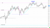
So overnight, price had been steadily traveling up since 0130. HHs, swing lows, rinse and repeat. I have the overnight high and last swing low marked on my chart as well as the previous day high.
So the market opened and did some of it’s usual back and forth movement, but didn’t quite make it down to the last swing low. Then it started marching toward the overnight high. It got there with some pullback along the way and then pierced that level. Price came back down, but not as far as the recent pullback - signs of price heading up. But I waited for a higher confirmation area - a RET above the overnight high. I entered, drew my DL and just watched. Price did move in my favor, but then it came back down. That was fine because that’s how price moves. Then my DL was pierced. I hung in there as price seemed to hug the line and was moving in the same trajectory as it. When the 2nd attempt at a HH didn’t happen, I exited (for a loss), but that’s how this works sometimes.
Next trade was a short since my DL was broken and yet another attempt at a HH occurred but wasn't successful. Price started moving quite well and then bounced off the 50% area of the initial up move of the day. How do you like that?? (sarcasm) Yes I saw the behavior, but tried to give price some room and waited for price to cross my SL more definitively and be a little more patient. I decided to watch from there.
The next bounce off the 50% line I saw and was wishing I’d taken the trade (CWS), but was happy to have seen it so I hope to trust that kind of behavior more down the line.
A combo of simming and watching is working for me right now. I’ll keep at it.
I’ve got a ton of lines on my chart and while it can be confusing, it was quite interesting to see subsequent actions (hesitations, equilibrium, hanging out there) in these areas. At this point, I’m not sure which lines are needed and which lines are a distraction. I don’t want to be seeing bunnies.
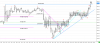
I definitely have more range observing to do. However, the LITHA tactic was a good one in this instance. It’s hard to sit on my hands, but the worst thing that can happen is that price goes beyond your entry a few points. The best thing is that it goes to the opposite end of the range and beyond.
- Big push outside range seeking new value.
- Can’t hold - back down toward midpoint inside the overnight range, with price hovering more toward the upper end of the range.
- Another attempt up, but can’t get up to 62, but does not go back into the range.
- Repeat of 3.
- Price traveled back to the upper end of the range.
- Still couldn’t reach previously established high.
- Price traveled back to the overnight 50% range area.
- A move up toward the midpoint and then back down to the low end of the overnight range.
- Second move up toward the premarket midpoint and back down to the overnight 50% area.
- Price headed down to the overnight swing low area. At this point now, price has moved as much DOWN away from the overnight range area as it did UP in the premarket hours. Nice symmetry.
- Price marched up to “home”, the overnight 50% area.
- Decent pullback, but with AMT in mind, I assumed that a trip was going to be made either back down to 38 or up to 64. Since the SL had been broken, I tried for a long. Yes - price was currently back inside the SL, but the entry would likely be on or outside of the SL.
- Price did pop down a bit more, but headed back up to the 50% area.
- Pullback that broached the DL, but price was traveling in the same slope as the DL so I just held tight - even though my entry was hit. Price wasn’t giving signs that the up movement was over. It had gone up and was pulling back. The DL hadn’t been compromised at the last swing area was still intact.
- Technically there was a lower high, but price was moving sideways. Looking left, the price area coincides with the premarket 50% area.
- Drew the darker blue DL in as price was moving sideways and down more, but nothing drastic. Figured another shot at the 50% area might be attempted. Price grazed the DL but resumed upward movement.
- Another LH, but price was back inside the DL.
- Price flirting with the DL.
- After a slight pause, price hits the premarket high area again. Not wanting to push my luck, I exited just north.
I definitely have more range observing to do. However, the LITHA tactic was a good one in this instance. It’s hard to sit on my hands, but the worst thing that can happen is that price goes beyond your entry a few points. The best thing is that it goes to the opposite end of the range and beyond.
Today for me was eye opening to ranges and AMT. In the overnight hours, price reached a high of around 4220 and then headed down to a low of around 4202 - just shy of a 20 point range. The 50% area was like a magnet, but most of the price activity was in the lower section of the range.
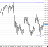
A - Yet again in the hour prior to the NY open, price had been at the 50% area.
B - It traveled down to the low end of the range.
C - A few minutes before the open, price hadn’t quite gotten to the 50% area, but it wasn’t going back down to the lower end of the range either.
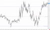
Today illustrated the whole concept of LITHA when trading ranges (not that I was trading/simming/thinking of entries). I’m going to find some more ranges to review - good stuff.
A - Yet again in the hour prior to the NY open, price had been at the 50% area.
B - It traveled down to the low end of the range.
C - A few minutes before the open, price hadn’t quite gotten to the 50% area, but it wasn’t going back down to the lower end of the range either.
- At the open, price shot up toward the upper end of the overnight range.
- Price came back down to the 50% area and there was definitely quite a bit of trading occurring around that area.
- Another jaunt up to the upper end of the range and that area was surpassed, but price didn’t hang out there for very long.
- Right back down to the 50% area with very little hesitation.
- Another trip back up and this time price went even further than the first two tries. A test of the range high occurred, but then price couldn’t get back up to the previous high.
- Price moved toward the 50% area, but couldn’t make it.
- Not surprisingly the upper end of the range was tested again. It didn’t hold for long.
- Price cascaded down to the 50% area. Some hesitation and hung out there for a while.
- An attempt up again, but the 50% area of the recent down move held.
- Price went screaming through the 50% area downward.
- Sight pause before the lower end of the range was reached.
- HL followed by a trip back up to the 50% area, but traders brought price back down to the range low.
- Sellers looked quite lonely down there though and price immediately reversed.
- Back to the 50% area.
- Very slight pullback.
- Price definitively surged through the 50% area.
- Movement much more solid up than it had been going down and back up to the upper end of the range.
Today illustrated the whole concept of LITHA when trading ranges (not that I was trading/simming/thinking of entries). I’m going to find some more ranges to review - good stuff.
I realized that I didn't post my observations from yesterday.
A hinge was developing overnight. Around 0800 price bounced off yesterday’s swing high (2/9).
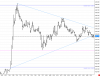
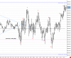
A hinge was developing overnight. Around 0800 price bounced off yesterday’s swing high (2/9).
- At the NY open, price was right around the middle of the range/hinge.
- Price popped down and went through the 2/9 swing high, but there was some congestion on the way down and out of that area.
- Back up to the middle with lots of buying and selling. Price was inching up, but nothing substantial.
- Price did make an attempt to get higher, but it fell quickly.
- Hanging out in the middle again. Pop up.
- Followed by an equidistant pop down. Seeing AMT at work is pretty amazing to watch.
- Another attempt to the upside and this time, price doesn’t make it to the previous high.
- Price travels to the other end of the range and does get lower than the most recent trip down, but not as far as just after the open.
- Price only makes it back up to the middle before trying low again. Some lonely sellers as traders soundly reject that area.
- Heading back in the other direction and again the high is lower than the two previous attempts.
- Another move back down. This time, price is the lowest it has been in almost three hours. The swing high area was sliced through, but price didn’t hang out there for long.
- On the way back up, the swing high area was tested and price hung out in the 50% area before making another trek up. This time, price exceeded the last high.
- Slight pullback, HH and price is moving more definitively up.
Yet another range in the overnight. Definitely seems like understanding ranges is key… From 0300 to 0900, price moved within a 7ish point range. Up and down it went stopping off in the middle . Initially, more time was spent in the upper portion and then as it got closer to the NY open, price spent more time in the lower range. At 0800, price hit the bottom and sort of launched itself up to the middle. Very little hesitation at the middle before heading toward the top.
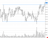
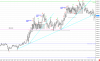
As always, patience is the name of the game. I keep telling myself that one price bar isn't usually definitive, but multiple pieces of information tell the story.
- After a trip to the upper end of the range, price made it back to the 50% level and then continued back up. It did not go back down to the bottom end.
- Higher low - didn’t even make it to the 50% area, but it also didn’t make it to the upper end of the range either.
- Just prior to the open, price breaks out of the range more definitively than it had since the range was established.
- Quick pop up and a retest of the range high.
- Price approaching the high from back on 1/23.
- Price makes it through that level, but with hesitation.
- Parabolic pop up seeking new value.
- A trip back down near the 50% area of the up move followed by a LH.
- For the time being, price isn’t moving higher, but it isn’t moving lower. Traders have found value.
- HH and drew a DL. Price is inching up. No pullback, but a rather narrow space where trades are occurring.
- Price moves toward the previous value area but doesn’t quite get there. As much movement up that was accomplished (in one minute) was erased (in one minute).
- LH as DL is approached and breached. Price is heading back to the previous value area.
- Back to the 1/23 PDH which also coincides with the most recent value area. Correlation? I think so…
- Price sort of launched off/out of that area, but wasn’t able to reach the previous LH and back into the value area.
- Price ventures south - to the 50% area of the move, below the value area and below the 1/23 high.
- Price movement is steady and heading back up.
- Swift move down. Traders just spent more time inching back up, but in one fell swoop price popped down and erased much of the recent gain. Back into the value area.
- And back again to the 1/23 area. As much as price isn’t going higher, it isn’t penetrating below this area. And the more shallow DL is hit - uncanny.
- Surpassed the previous LH.
- Back to where price was 30 minutes ago.
- HH established
- Spending more time in equilibrium than in seeking new value.
- LH followed by a slightly deeper pullback.
- And then a shot upwards to the high from 15 minutes ago.
- 4300 is hit and bounced off of. Price does not glide through this area.
- Pullback, but not deeper than the previous pullback.
- 2nd attempt at 4300 and traders respond more fervently than the previous time - like a hot stove was touched.
As always, patience is the name of the game. I keep telling myself that one price bar isn't usually definitive, but multiple pieces of information tell the story.