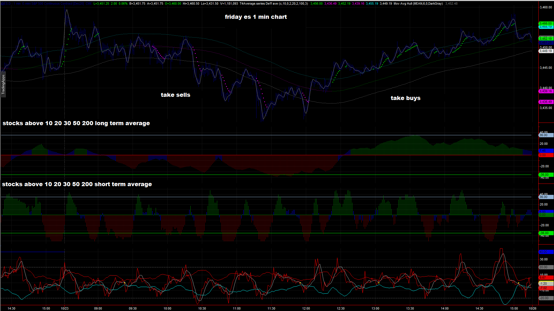
The chart below shows the strongest stocks of S&P 500

This chart shows the long- and the short-term strength of the S&P500 stocks with the strongest momentum.
I use this chart to choose some stocks that show strength.
I then use simple technical analysis - moving averages, candlesticks, Bollinger Bands, support & resistance - to narrow down the possible tradable stocks.
The other thing I'm looking for is the stocks' Relative Strength.
It must be going up and above its 20-day moving average.
The chart of GPS, for example, is:

1. Price moves above its rising 20-day moving average - the green box.
2. Price broke above a resistance line - the blue line.
3. Price reached the upper Bollinger Band with a huge bullish candlestick, a sign of a strong uptrend
4. The stock's Relative Strength is going up and mostly above its 20-day moving average - the yellow box.
This chart shows the long- and the short-term strength of the S&P500 stocks with the strongest momentum.
I use this chart to choose some stocks that show strength.
I then use simple technical analysis - moving averages, candlesticks, Bollinger Bands, support & resistance - to narrow down the possible tradable stocks.
The other thing I'm looking for is the stocks' Relative Strength.
It must be going up and above its 20-day moving average.
The chart of GPS, for example, is:
1. Price moves above its rising 20-day moving average - the green box.
2. Price broke above a resistance line - the blue line.
3. Price reached the upper Bollinger Band with a huge bullish candlestick, a sign of a strong uptrend
4. The stock's Relative Strength is going up and mostly above its 20-day moving average - the yellow box.