Close -180, MFE +300-350ish. Stayed in plus for a long time but markets are simply reluctant to be easy today. Could be a shake weak hands out moment but I can't be up tonight to bet on it.

You are using an out of date browser. It may not display this or other websites correctly.
You should upgrade or use an alternative browser.
You should upgrade or use an alternative browser.
Snuskpelle's (kind of) Intraday Adventures 2019
- Thread starter Snuskpelle
- Start date
Buy DE30EUR x 5 @ 13223 stop 13122
Buy JP225USD x 8 @ 23836 stop 23764
Thursday didn't end up as bad as I feared but stops would have been hit so it's good I exited. Re-entering, will add more to DE30 position after overnight gap if trend seems to be right way. Would have been buying earlier today but out with girlfriend driving.
On overall strategy, just collecting market beta for now when I sense it's relatively risk free (tail risk aside). Will try to redeploy dumb beta algo after New Year's Eve with improvements.
Buy JP225USD x 8 @ 23836 stop 23764
Thursday didn't end up as bad as I feared but stops would have been hit so it's good I exited. Re-entering, will add more to DE30 position after overnight gap if trend seems to be right way. Would have been buying earlier today but out with girlfriend driving.
On overall strategy, just collecting market beta for now when I sense it's relatively risk free (tail risk aside). Will try to redeploy dumb beta algo after New Year's Eve with improvements.
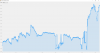
My broker's trading app currently has a bugged color scheme that makes it unintelligible. Currently working on my own PL calculations for tax purposes. This also allows me to show a crude PL graph by trade number also taking into account home currency fluctuation. Apologies for banana republic currency scale, approximately divide by 10 to get USD from SEK.
If this chart looks like something with minimal Sharpe ratio and potential to crash and burn, you're not entirely incorrect. However, keep in mind that I've severely scaled up account via deposits, especially in June, and trying quite different strategies over this year. Also, the chart looks extra dramatic because sub-trades that were concurrent (even possibly long vs short in different indices) plot as different trades with imaginary drawdown.
Will look into converting this into percentages normalized on current account size, but that will take a lot more effort.
If this chart looks like something with minimal Sharpe ratio and potential to crash and burn, you're not entirely incorrect. However, keep in mind that I've severely scaled up account via deposits, especially in June, and trying quite different strategies over this year. Also, the chart looks extra dramatic because sub-trades that were concurrent (even possibly long vs short in different indices) plot as different trades with imaginary drawdown.
Will look into converting this into percentages normalized on current account size, but that will take a lot more effort.
Attachments
Buy DE30EUR x 14 @ 13243 stop 13203
The rest of position. Actually gapped rather well so would have been better holding overnight, but I didn't feel like having the risk as previous noted. UK data looking better than expected, maybe related.
The rest of position. Actually gapped rather well so would have been better holding overnight, but I didn't feel like having the risk as previous noted. UK data looking better than expected, maybe related.
Buy JP225USD x 8 @ 23815 stop 23763
Nonsense down move on trade war related news. Monitoring.
Nonsense down move on trade war related news. Monitoring.
We'll see. Exiting if going below -1000 as I don't intend to lose more tonight nominally speaking.
Edit: Moved DE30EUR to same stop (the upper one) to reduce max risk in case of e.g. failure to access broker app.
Edit: Moved DE30EUR to same stop (the upper one) to reduce max risk in case of e.g. failure to access broker app.
Last edited:
Closed JP225. -900
The lack of any trend makes it a moot point applying this much leverage.
The lack of any trend makes it a moot point applying this much leverage.
Going to bed. I'm back in the following cycle on the last couple of days:
Win -> Increase leverage - > Lose -> Decrease leverage -> Win...
Win -> Increase leverage - > Lose -> Decrease leverage -> Win...
Ok cool, DE30EUR stop was hit by 2 points this morning so I'm down 600 on that. Would be up 1500-2000 or something if not stopped.
Restarted long XAG short XCU pair trade algo from previous this year on 16k with modifications:
A) Max drawdown calculated from starting account size and staying fixed in USD.
B) Slowly scales up to full postion sizes over multiple weeks only if trend being favorable.
C) Shared XAU/XAG long rather than XAG only.
A) Max drawdown calculated from starting account size and staying fixed in USD.
B) Slowly scales up to full postion sizes over multiple weeks only if trend being favorable.
C) Shared XAU/XAG long rather than XAG only.
Last edited: