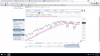
I saw this online today. He says that the 50 week moving average is about to intersect with the 100 week moving average.
I tried to plot it on a graph but I am not seeing it. I used 3 years instead of 2, but I still don't see it crossing anytime soon. It looks like they are running parallel to each other like they have for the last 3 years.
Either I plotted it wrong or he is fear mongering....
-----
Not all "death crosses" are created equal.
In a note to clients, Intermarket Strategy Ltd. Chief Executive and Strategist Ashraf Laidi points out that the S&P 500's 50-week moving average is falling below its 100-week moving average.
This "statistically significant" death cross has only happened twice is the past two decades, Laidi points out. The first took place in 2001 and was followed by a 37 percent decline in the index, while the second pattern occurred in 2008 and preceded a 48 percent drop.
-------
He posted a few graphs in the video with the DJI and the S and P, but doesn't bother illustrating the Death Cross.
Considering that it was the foundation of his story, it seems like it would be the obvious thing to do.
Am I missing something.......did I plot it wrong ?
BTW, how do you post a pic that is in the thread, without a PNG like I did ?
And how do you do a screen shot without posting your tabs at the top of the pic?
http://finance.yahoo.com/news/p-500-death-cross-could-123626285.html
------
Attachments
Last edited: