

 I read on ET and elsewhere of the virtues of spread trading.
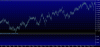
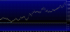
This example (see charts) is trend trading a spread of emerging market vs. Aus. dollar.
It is not at all mean reversion trading on cointergrtated and correlated legs.
It is generating performance ( Alpha? ) by trading continued divergence. One leg will continue
to significantly outperform the other leg and the continued widening of the spread is the trend.
Just maybe, one could select a few of these that are not closely correlated and have some real
diversification of positions as opposed to selecting 5 or ten stocks.
This is not about exchange traded spreads and curve trading or MR. Sure, when a spread chops/ranges for
a while consistently it would be nice to see that and realize for whatever reason the legs are
temporarily moving together and to have a strategy to fade the extremes and close on the other side.
i would like to use this space to "deposit" for later viewing and analysis, spreads that i am tracking.
I have a limitation for many reasons of 200 such spreads. All are of liquid ETF's. No stocks.
of course single leg etf charts are in play as well.
Any comments are welcome. The main time consuming issue in "amateur land" where i come from is organizing this data.
In fact a major issue i struggle with is NEUTRAL or NOT NEUTRAL. it makes no sense to spread the 2 year bond with nat gas
for reasons other than 11x 2year = nat gas for neutral so thats not what i mean.
In the example charts however, selling 2.5ish the amount of Aus dollar to neutralize EEM produces a very nice trend
with 30% outperformance of a non neutral spread which is the type of chart produced by most software packages. (chart is approx. 750 trading days)
This makes sense to neutralize but i wonder what traders in the world trade off of ....the neutral chart or non neutral chart.
Both present unique opportunities. Most of the above verbage was a setup for that question.
Comments?
Ps. The right chart is the neutral chart. Being short more Aus. Dollar to neutralize the more volatile EEM etf has paid.
Last edited: