Quote from Ivanovich:
I guess what would be good to know is when you think this will occur. I understand from your last post you say a few more days. Gotcha. But when you say in the OP that "there's no better time than right now" you indicated Wed'/Thurs of this week. If someone is leveraged buying these ETFs, that might not have worked out so well.

You are using an out of date browser. It may not display this or other websites correctly.
You should upgrade or use an alternative browser.
You should upgrade or use an alternative browser.
Port1385 says to "double down" in your 3x inverse positions!!!
- Thread starter Port1385
- Start date
I took some time to rethink and redraw my master spx chart from scratch. I added the RSI indicator which seems to have been a good indicator these last 10 or so years to demonstrate oversold and overbought conditions.
The fib fan on the chart extends back to 1932 and you can see that this is drawn exactly on a log chart. The purple line is not a retracement, but a trend line connecting 1974 and 1982.
Interestingly enough, that trend line from the 70s is exactly at my price target of the S&P which I have stated here many times.
Now focus on the RSI. We WERE as oversold now as we were at the bottom in 2002. However, I have taken the liberty to examine each time in history when we were at the same level or worst on the RSI in regards to the oversold condition:
June 1940 Low of that year was right at 9. By April 1942, a new low was set at 7.5.
September 1946 Low 14.40. By June 1949, a new low was set at 13.60.
May 1970. New lows were set in 1974.
No new lows were set after the selloff during these years.
October 1957
May 1962
Therefore, an extremely oversold RSI does not necasarily mean a bottom, but may indicate that a newer low may be yet to come.
Now look at the RSI now. We are at the same levels as we were in May 2008. Everytime between 2000 and December 2002, when the RSI indicator reached this level it was a great time to sell.
The rest of this chart is self explanatory.


The fib fan on the chart extends back to 1932 and you can see that this is drawn exactly on a log chart. The purple line is not a retracement, but a trend line connecting 1974 and 1982.
Interestingly enough, that trend line from the 70s is exactly at my price target of the S&P which I have stated here many times.
Now focus on the RSI. We WERE as oversold now as we were at the bottom in 2002. However, I have taken the liberty to examine each time in history when we were at the same level or worst on the RSI in regards to the oversold condition:
June 1940 Low of that year was right at 9. By April 1942, a new low was set at 7.5.
September 1946 Low 14.40. By June 1949, a new low was set at 13.60.
May 1970. New lows were set in 1974.
No new lows were set after the selloff during these years.
October 1957
May 1962
Therefore, an extremely oversold RSI does not necasarily mean a bottom, but may indicate that a newer low may be yet to come.
Now look at the RSI now. We are at the same levels as we were in May 2008. Everytime between 2000 and December 2002, when the RSI indicator reached this level it was a great time to sell.
The rest of this chart is self explanatory.


I am very much doubled down in my SRS/FAZ since Friday's close, but a reversal cannot come soon enough.
The more I see these charts and the more I read people's interpretations of them, the stronger my sentiment grows that technical analysis is purely subjective. And to that end, I hope your interpretation is right, because after all, I am a realist, and I understand the fundamentals, the facts, the ridiculous unwinding, the egregious transfer of wealth, the shady back door talks of propping up equities, ad nauseum, but for every bear there is a bull. You've got a 50/50 chance to get it right, and I hope you do. At the same time, I fear what "getting it right" really equates to, though, because it is hard for me to come to terms with my desire to make money when it is solely at the pains of my retired parents and the college fund IRAs of the middle class in my neighborhood.
Everything that has been going on as of late is entirely unprecedented, and there really is no contingency plan. The more I read of Weiss and ZH the more I realize that our irrational exuberance of the last 20 years may very well destroy the livelihood of our children. It is purely fantasy, a sort-of delusional superiority complex birthed out of 200 years of being at the top, to think that our government will always find a way. It is frightening to see the marked increase in CDS against the default of treasury bonds--the US gov't itself.
All I can wish for is a swift return to normalcy, albeit to desire such a lofty goal coincides with a true suspension of disbelief: the same fumes that fuel this brief surge in optimism will inevitably grow nauseating as they lack the warranting fundamentals. America was built on a dream, but the wealth of the middle class may ultimately be built on a fantasy, a house of cards.
The more I see these charts and the more I read people's interpretations of them, the stronger my sentiment grows that technical analysis is purely subjective. And to that end, I hope your interpretation is right, because after all, I am a realist, and I understand the fundamentals, the facts, the ridiculous unwinding, the egregious transfer of wealth, the shady back door talks of propping up equities, ad nauseum, but for every bear there is a bull. You've got a 50/50 chance to get it right, and I hope you do. At the same time, I fear what "getting it right" really equates to, though, because it is hard for me to come to terms with my desire to make money when it is solely at the pains of my retired parents and the college fund IRAs of the middle class in my neighborhood.
Everything that has been going on as of late is entirely unprecedented, and there really is no contingency plan. The more I read of Weiss and ZH the more I realize that our irrational exuberance of the last 20 years may very well destroy the livelihood of our children. It is purely fantasy, a sort-of delusional superiority complex birthed out of 200 years of being at the top, to think that our government will always find a way. It is frightening to see the marked increase in CDS against the default of treasury bonds--the US gov't itself.
All I can wish for is a swift return to normalcy, albeit to desire such a lofty goal coincides with a true suspension of disbelief: the same fumes that fuel this brief surge in optimism will inevitably grow nauseating as they lack the warranting fundamentals. America was built on a dream, but the wealth of the middle class may ultimately be built on a fantasy, a house of cards.
Quote from Port1385:
Im tired of seeing all the foolish bulls on ET making every attempt to pump junk stock.
I am now declaring that its time to "double down" into the 3x inverse etfs. There is no better time then right now.


Do you have any idea how leveraged ETFs work? These instruments are not intended to be used for overnight positions. They are intended to be used as intraday trading vehicles or hedges. Read a prospectus.
You should definitely gain a better understanding of them before you lose all of your money.
Anyways good luck...you will probably need it.
A long term hold is not recommended, but a short or intermediate term hold can be worth it. If you set your stops right, then you should be taken out of the position properly when the price does drop and decay.
Lets say back a few months ago when the TZA was at 50 bucks and went to 120 in the next few weeks. Would a buy and hold over the intermediate term been worth it in this instance with a properly set stop?
Lets say back a few months ago when the TZA was at 50 bucks and went to 120 in the next few weeks. Would a buy and hold over the intermediate term been worth it in this instance with a properly set stop?
Ok its time to buy buy buy 3X inverse. It could easily double and triple within a few weeks time. Buy and hold short term 3xxx. Set your stops appropriately and when it does turn then dump dump dump.
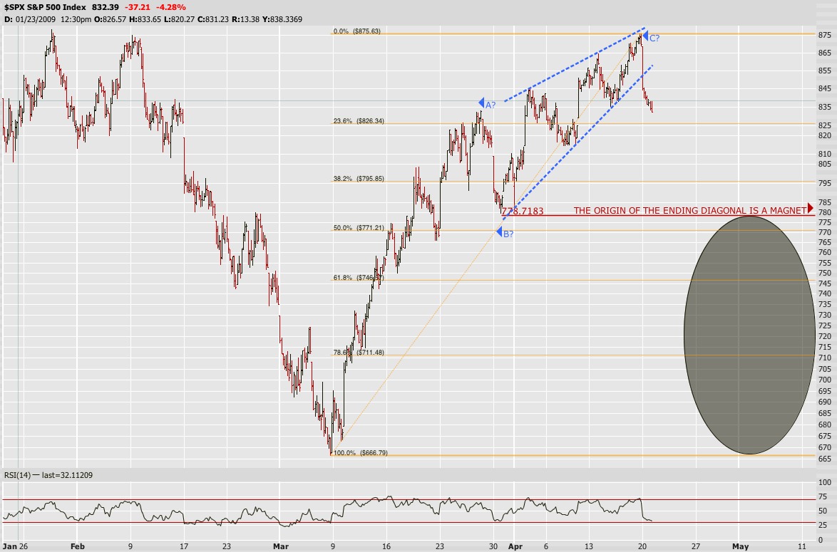
Price is falling through the trap door of the bearish wedge. Next stop is my target of 550. See you at the bottom boyz!!!
Price is falling through the trap door of the bearish wedge. Next stop is my target of 550. See you at the bottom boyz!!!

Look at the vix how its setting up. Its retracing predictably and then will follow a nice thrust upwards.
http://stockcharts.com/h-sc/ui?s=$VIX&p=D&b=9&g=0&id=p35241451085
http://stockcharts.com/h-sc/ui?s=$VIX&p=D&b=9&g=0&id=p35241451085
The bottom line is, if you are right (which you probably will be, eventually, because won't everyone?), why try to fight the market? I sold my FAZ today and got into FAS.