
http://static.seekingalpha.com/article/115525-the-scariest-chart-ever
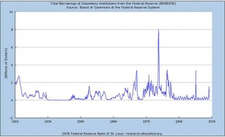
Here is a chart of borrowing by U.S. banks from the Federal Reserve through Dec. 2007:
Now, same chart through December 2008:
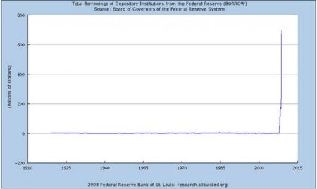
Anyone still think there are not some rough patches down the road?
Editor's note, 1/29/09: The original version of this post indicated that the charts show 'federal borrowing', and not borrowing by banks from the Fed. That has been corrected here.
http://eastcoasteconomics.wordpress.com/
Here is a chart of borrowing by U.S. banks from the Federal Reserve through Dec. 2007:
Now, same chart through December 2008:
Anyone still think there are not some rough patches down the road?
Editor's note, 1/29/09: The original version of this post indicated that the charts show 'federal borrowing', and not borrowing by banks from the Fed. That has been corrected here.
http://eastcoasteconomics.wordpress.com/