New Elite Trader website layout is not as good as old ET

Status
Not open for further replies.
I can easily adjust the palette to be exactly what it was before. It's really not a big deal to me because I don't use the classic style anyway.

It's probably safe to adjust the current classic color palette to the old classic palette b/c not many people complained about it.
 
As I said I like the old one but to be fair a couple of people said on another thread they quite like the current classic version. Can't please everyone, but it should be the majority.
 
Of course there are things missing on the mobile layout. There's hardly any space to work with! That's just the nature of having to deal with a drastically narrower screen versus a desktop or full-size laptop. As the screen size gets smaller, the number of features that go bye-bye increase.

If you use landscape/horizontal view on mobile, I don't see anything missing.

Go vertical view/portrait, lots of things missing. The banner Elite Trader doesn't even show at the top.

Didn't know I had to use the horizontal view. First time experience with such issue.
 
As I said I like the old one but to be fair a couple of people said on another thread they quite like the current classic version. Can't please everyone, but it should be the majority.

If you have modern, classic, and old classic color palettes, you should cover everyone. Don't delete anything. Just add one more color palette.
 
Baron, the smileys are kind of blur nowadays. It could just be the change in background colour as I explained before, but please compare it with the old colour scheme where they were really sharp.

Also, I've got some feedback on how the email alerts render nowadays on mobile, but I know you've got your cup full in that department so when you're ready.
 
Ok, I have adjusted the palette for the classic version to be exactly what it used to be.

I have added page navigation to the top of the page.

@justrading, I will look into the smiley issue. And yes, I want to hear your feedback on the email alerts.

@volente_00, I just used my ipad and accessed the private messaging with no problem. What's the issue on your end?
 
Ok, I have adjusted the palette for the classic version to be exactly what it used to be.

I have added page navigation to the top of the page.

@justrading, I will look into the smiley issue. And yes, I want to hear your feedback on the email alerts.

@volente_00, I just used my ipad and accessed the private messaging with no problem. What's the issue on your end?
Ok, I have adjusted the palette for the classic version to be exactly what it used to be.

I have added page navigation to the top of the page.

@justrading, I will look into the smiley issue. And yes, I want to hear your feedback on the email alerts.

@volente_00, I just used my ipad and accessed the private messaging with no problem. What's the issue on your end?

"I have added page navigation to the top of the page."

you may have started a useful trend.
 
Thanks Baron, much appreciated.

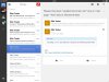
Re the email alerts, it is only an issue on my iPad, not the PC. As you see from the screenshot, there is a small button to expand the mail and show the View This Thread button, and right below it is a link to the home page. The problem is if you are not precise in tapping that little button, you get sent to the home page. That button only comes in with second and subsequent alerts to the same thread on the same day.

I don't know whether you have any control at all over how far apart the button and link are, it could be the Gmail app doing this, but if possible to separate them somewhat it would be really helpful.
image.jpg
 
Status
Not open for further replies.
Back
Top