Nearly All Warming caused by Data Adjustment - Peer Reviewed

and I showed you, you could go back and see the models failed even more.

your chart is ridiculous... we are talking about models projections into the future when tested on real time data... not modeling past scenarios...

you are not seriously going troll like that are you.

1. The scailng is not reasonable given the starting point which was cherry picked. And i just destroyed gwb's argument using Trump's EPA site.

2. He picked the data point to suit his narrative - he then averaged out THREE difference scenarios instead of using the best case - https://www.skepticalscience.com/ipcc-overestimate-global-warming.htm

3. Here is actual model and real temperature change, where is the significant margin you speak of - https://www.skepticalscience.com/pics/IPCC_FAR_Since_1880.png

A Trump supporter talking about truth? You peddle conspiracy theories about how DNC offed Seth Rich, this is the person I should rely on for truth and science?
 
Last edited:
and I showed you, you could go back and see the models failed even more.

3. you chart is ridiculous... we are talking about models projections into the future when tested on real time data... not modeling past scenarios...

you are no seriously going troll like that are you.

If the models failed so badly then why the fake chart? Why no transparency on what data set was used to make the chart? Why not show the spread instead of the average?
 
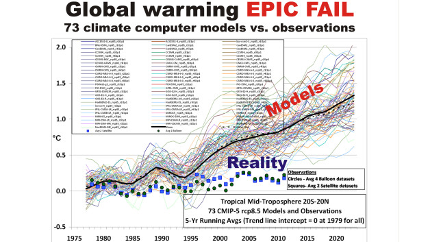
no one faked the charts... here is another look for trolls with facts issues.

the models projected far more warming than there has been.

only liars are denying this fact.


spencer-models-epic-fail.jpg


If the models failed so badly then why the fake chart? Why no transparency on what data set was used to make the chart? Why not show the spread instead of the average?
 
no one faked the charts... here is another look for trolls with facts issues.

the models projected far more warming than there has been.

only liars are denying this fact.


spencer-models-epic-fail.jpg


More fake charts, her's how you plot data with full transparency while in Christie's case you don't even know what data set he used.

1023.jpg
 
If I am wrong, I am more than happy to come back to this site in the near future and admit that I am wrong in the year 2025.
 
If I am wrong, I am more than happy to come back to this site in the near future and admit that I am wrong in the year 2025.

How could someone be wrong by composing this clever statement! Who has had Ingenious knowledge in future science that to be discovered!
 
'Bergxit': One Of The Largest Icebergs On Record Set To Break From Antarctic Shelf
Experts say the chunk of ice will be larger than the island of Bali.
06/07/2017
http://www.huffingtonpost.com.au/20...o-break-fr_a_23018169/?utm_hp_ref=au-homepage

"
How long that process could take is difficult to pinpoint. But scientists estimate that if all the glaciers behind Larsen C ended up in the ocean, it would raise global sea levels by about 10 centimeters, or 4 inches."

595d1fac2100003700fc5683.jpeg
 
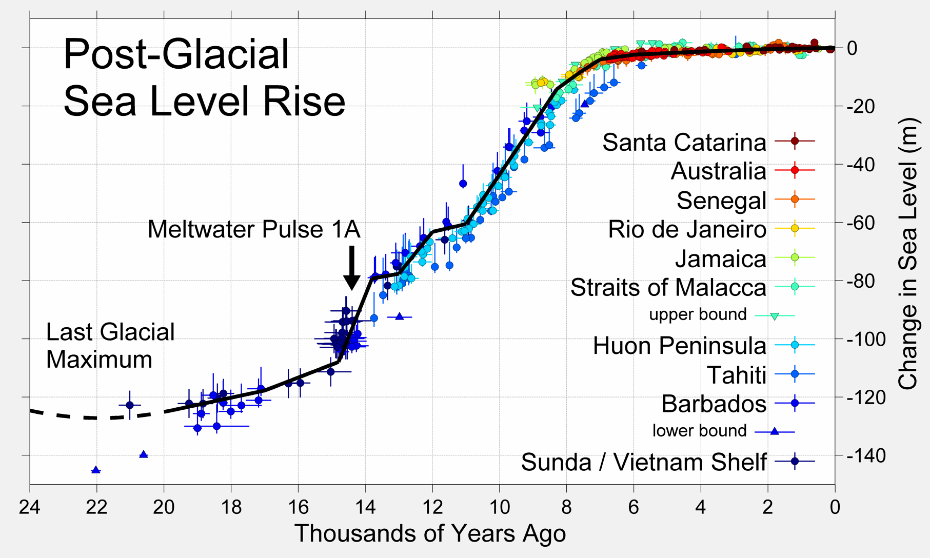
oceans have been rising since the last ice age.
change in ocean temps leads change in co2 levels.

when you see a chart like this... do you still think that man is causing the oceans to rise?


Post-Glacial_Sea_Level.png


'Bergxit': One Of The Largest Icebergs On Record Set To Break From Antarctic Shelf
Experts say the chunk of ice will be larger than the island of Bali.
06/07/2017
http://www.huffingtonpost.com.au/20...o-break-fr_a_23018169/?utm_hp_ref=au-homepage

"
How long that process could take is difficult to pinpoint. But scientists estimate that if all the glaciers behind Larsen C ended up in the ocean, it would raise global sea levels by about 10 centimeters, or 4 inches."

595d1fac2100003700fc5683.jpeg
 
you can go to judith currys site and see a discussion of this chart.
there is some question about the grey lines... it looks like your author overstated the degree of uncertainty....

however, you realize that outside the grey lines even agw nutter scientists agree the models have failed.

So when I say the models are failing... you can see they have popped out of the grey box.

that is failing models.


More fake charts, her's how you plot data with full transparency while in Christie's case you don't even know what data set he used.

1023.jpg
 
Back
Top