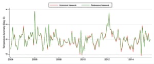
its funny how fraudcurrents finds charts that have nothing almost nothing to do with the discussion. He posts a yearly chart when we are looking at a cool of which began from the el nino peak about 2 years ago. His yearly charts would not be granular enough to see anything since 2016 would be a yearly high point.
we are talking about a rapid cooling over the last 2 years since the end of the el nino in 2016.
so you would think you would want to post a monthly data chart to take a look at what is happening.
And I created gistemp using their data to make sure the charts are similar and they are. We have been cooling quickly since the el nino.
Only trolls would deny the facts and the data.

we are talking about a rapid cooling over the last 2 years since the end of the el nino in 2016.
so you would think you would want to post a monthly data chart to take a look at what is happening.
And I created gistemp using their data to make sure the charts are similar and they are. We have been cooling quickly since the el nino.
Only trolls would deny the facts and the data.