
You are using an out of date browser. It may not display this or other websites correctly.
You should upgrade or use an alternative browser.
You should upgrade or use an alternative browser.
Is Fed's Monetary Base the Same as Fed's Total Assets?
- Thread starter Cyrix
- Start date
M
morganist
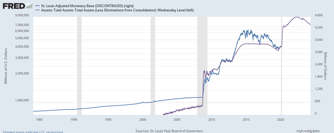
Why are their charts so difference?
What makes up the differences?
Thanks.
The monetary base of a central bank is made up of M1, M2, M3, M4 etc. This money enters circulation, it is used to make transactions or held in accounts. The assets of the central bank are held in central bank accounts. The central banks will often alter the assets they hold to hit macroeconomic targets, they use open market operations to do this. Thus in terms of your question I believe the monetary base is different to the central banks assets. This would explain the disparity you have noticed between the two readings.
There is some indication in this Cato paper that the writer does not correctly understand why the Fed decided it would be useful to pay a small interest on excess reserves. Also this: "As a result, the introduction of interest on reserves in October 2008 and the resulting accumulation of reserves by banks not only caused a collapse of Federal funds lending from over $200 billion to nearly a third of that"... I think is backwards. But it is too late in the evening for me to think clearly. Perhaps I'll comment on this later.
Suffice it to say I was under the impression that the Fed decided to pay interest on only excess reserves, and not on required reserves. The writer of this article is under the impression that the Fed pays interest on both required and the excess reserves. I will need to look into that. There is no reason why the Fed would pay interest on required reserves, but during the financial crisis there was a good reason the Fed instituted payment of a small amount of interest on excess reserves, as this set a limit under which the Fed funds market would not go. During that time when demand for credit dried up, and the Fed was buying pre- announced quantities of treasuries on the secondary market. interest rates were naturally, and intentionally, driven down, because Fed buying caused reserve account to swell. Had the Fed not stepped in and began to pay a small interest on excess reserves the funds rate would have been rapidly driven toward zero.
One of the reasons why I asked the original question was that it was unclear why the Monetary Base chart did not increase in the recent round of easing, while the Total Assets did.
Some twitters say that the Fed is doing quantitative easing again, but it is not reflected in the Monetary Base above.
Some twitters say that the Fed is doing quantitative easing again, but it is not reflected in the Monetary Base above.
M
morganist
One of the reasons why I asked the original question was that it was unclear why the Monetary Base chart did not increase in the recent round of easing, while the Total Assets did.
Some twitters say that the Fed is doing quantitative easing again, but it is not reflected in the Monetary Base above.
They could be Quantitative Easing but not putting the money into the economy. They may be using the QE funds to Qualitatively Ease. This means they change the structure of the reserves they hold on their balance sheet to have an impact on economic targets.