jerm, you are a lying sack of shit

This chart is anomalies, right?
<img src="http://media.tumblr.com/14a568ff1a221d3e419dac0d28960a1c/tumblr_inline_n93eowX5DW1qij8k6.bmp">
")
I have no idea. I don't have a dog in this fight. I just like to give Jem ammunition to throw at FC because he gets all frothy in the mouth when he sees this stuff.
In this particular instance, I guess you can say I am trolling.
jerm, you are a lying sack of shit
there is no consensus.... when the papers were examined on 41 out of 11000 argued that man made co2 caused warming... and I read a few of them... and those were all based on failed models.
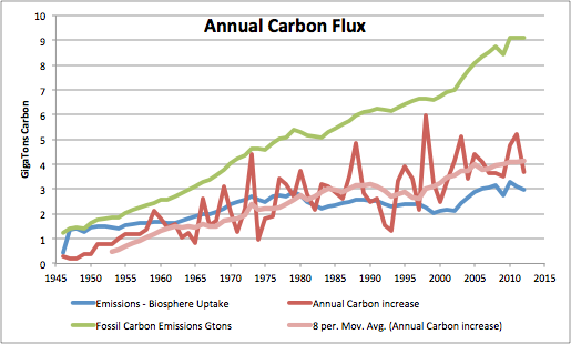
The shape of the annual carbon increase resembles the shape of the global sea surface temperature (HADSST3), especially after reliable CO2 measurements began by Keeling after March 1958. Several known events are visible. Counting backwards: the 1998 El Niño, the 1994-5 El Niño, Mt Pinatubo in 1991, the 1986-7 El Niño, Mt Ruiz in 1985, El Chichon eruption in 1982, the 1972-3 El Niño, etc. Every positive peak is an El Niño and every negative peak is associated with a major volcanic eruption.
As can be seen in Figure 1, there is no relationship between the fossil carbon emissions curve and the annual carbon increase curve. That is because all the fossil emissions carbon is taken up by the biosphere or by the oceans according to Henryâs Law, and then sequestered there. The carbon in the atmosphere is controlled by temperature. This has been described by Dr. Murry Salby in this presentations at Sydney and Hamburg. He compares the CO2 curve to the integral of temperature. Here, I am going the other way mathematically, taking the differential of the CO2 curve as temperature and comparing it to known temperature data, the HADSST3 data.
- See more at: http://notrickszone.com/2013/10/08/...-co2-and-not-vice-versa/#sthash.gBOX3Ftl.dpuf
I am not sure what you point is... but you can see that the scaling is very screwy.
Why don't you try saying in english something intelligent you can back up with numbers. For all we know you may have a point.
I do not you chart is doing cumulative... where as the other chart is looking at annual emissions. with is bumpier line.

I have no idea. I don't have a dog in this fight. I just like to give Jem ammunition to throw at FC because he gets all frothy in the mouth when he sees this stuff.
In this particular instance, I guess you can say I am trolling.
OK, How about this? Jem, you are an intellectually dishonest ideologically deranged piece of shit.
Oh, and man has raised CO2 levels from fossil fuel burning and that in turn has raised temps. Only an idiot, or jerm, would doubt that at this point.
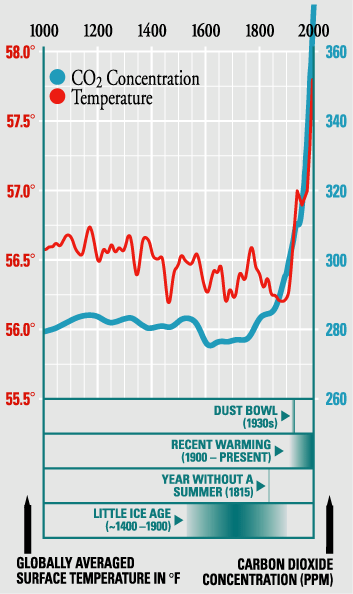
This chart better shows how CO2 levels lead the temp rise.
Oh, and jerm, CO2 is a GHG. On balance GHG's HEAT the planet. You Teadiot.