
You are using an out of date browser. It may not display this or other websites correctly.
You should upgrade or use an alternative browser.
You should upgrade or use an alternative browser.
In the Coronavirus Fight in Scandinavia, Sweden Stands Apart
- Thread starter wildchild
- Start date
I think Germsny is the coutry with the ideal response. Right Gwb?
Germany was leading Europe in terms of COVID response until two events:
- Loosening travel restrictions late last year -- including taking hospitalized COVID patients in from other countries which continues today.
- They trusted the EU to provide COVID vaccine doses and nearly none arrived.
So with Europe locking down again as these variants seem to be creating a third wave....
are any of these countries going to protect the high risk better?
These model countries are failing with the "follow the science" baloney.
Its time to follow the data and protect those who need protection directly.
1. start with education including and explanation of the fact of who is really at risk and why.
2. explain that family members are big risk of transmission for the high risk and it frequently happens in the home.
3. Explain the actual risk factors... and the strong correlation with vitamin D deficiency and how the healthy and low risk should seek to remedy that issue.
acting like the low risk and the high risk can be protected with the same montras of mask up... has clearly failed.
Acting like locking down the low risk is the only way to save the high risk...is failing too.
The high risk must be directly protected.
are any of these countries going to protect the high risk better?
These model countries are failing with the "follow the science" baloney.
Its time to follow the data and protect those who need protection directly.
1. start with education including and explanation of the fact of who is really at risk and why.
2. explain that family members are big risk of transmission for the high risk and it frequently happens in the home.
3. Explain the actual risk factors... and the strong correlation with vitamin D deficiency and how the healthy and low risk should seek to remedy that issue.
acting like the low risk and the high risk can be protected with the same montras of mask up... has clearly failed.
Acting like locking down the low risk is the only way to save the high risk...is failing too.
The high risk must be directly protected.

@wrbtrader @Tsing TaoYou use nonsense from Twitter and Blogs as your primary source -- trying to claim the charts & information is factual -- usually it is complete bullshiat.
If you review my postings which include a Tweet you will find that any Tweet I post falls generally into one of these categories:
- As evidence of what a politician or commentator tweeted.
- Reference to an article from a mainstream media source.
- Mocking a person or situation (cartoons / quips / etc.)
- A source of first-hand video of an event.
- Supporting evidence of what an article is stating (tweets that are embedded in an article).
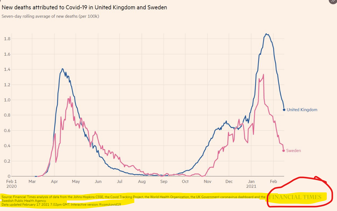
@gwb-trading Your post inferred that the below chart was bogus because it was posted by someone on Twitter. The chart was from the Financial Times.
So, if I repost some chart on Twitter that you have posted to the forum does that also invalidate the chart and data?
Last edited:
So, Merkel and company completely and totally fucked up by not doing what Trump did which was to secure contracts directly with vaccine companies. Got it.They trusted the EU to provide COVID vaccine doses and nearly none arrived.
You absolutely refuse to acknowledge the unprecedented, outstanding job and accomplishments of Trump wrt the pandemic.
When a leader of another country obviously and completely failed, you offer excuses and dismiss it.
Last edited:
No, no, no.....Let's compare Sweden to its direct neighbors.
View attachment 254941
https://ourworldindata.org/explorer...Align+outbreaks=false&country=SWE~DNK~FIN~NOR
Deaths are looking pretty dismal in Sweden.
That is from the same source, John Hopkins, as the data in the Financial Times chart. According to you, it is not valid data and totally bogus because it was posted on Twitter.
Total nonsense.
Talk about cherry picking.
@wrbtrader @Tsing Tao
@gwb-trading Your post inferred that the below chart was bogus because it was posted by someone on Twitter. The chart was from the Financial Times.
So, if I repost some chart on Twitter that you have posted to the forum does that also invalidate the chart and data?
Good luck with your fantasy that my post was referring to this chart that was in some twitter feed.
Tsing Tao continually posts questionable charts from COVID-denier Twitter feeds. He knows the charts are junk and refuses to provide the url of the Tweet -- because he knows it is a crap source.
After this I (and others) have to hunt down the source -- to demonstrate what complete bullshiat his charts are. Many times the data on the chart does not even match the claimed data source --- it is fake data used in an attempt to drive a political point.
The only good news is that both Twitter and Facebook are now shutting down many of these COVID-denier accounts which constantly push COVID misinformation.
The chart was created by the Financial Times utilizing the John Hopkins data.Good luck with your fantasy that my post was referring to this chart that was in some twitter feed.
Tsing Tao continually posts questionable charts from COVID-denier Twitter feeds. He knows the charts are junk and refuses to provide the url of the Tweet -- because he knows it is a crap source.
After this I (and others) have to hunt down the source -- to demonstrate what complete bullshiat his charts are. Many times the data on the chart does not even match the claimed data source --- it is fake data used in an attempt to drive a political point.
The only good news is that both Twitter and Facebook are now shutting down many of these COVID-denier accounts which constantly push COVID misinformation.
So, in your opinion, the John Hopkins, WHO, and UK gov data is junk and the Financial Times is a questionable news source.
No, no, no.....
That is from the same source, John Hopkins, as the data in the Financial Times chart. According to you, it is not valid data and totally bogus because it was posted on Twitter.
Total nonsense.
Talk about cherry picking.
It is complete junk when you post a questionable chart and refuse to provide the source (URL) where the chart came from.
So please provide us with the url of the source where your UK / Sweden death chart came from. Did you draw it yourself?
We have caught Tsing Tao posting so many charts now with fake data -- where the chart had notations that it came from John Hopkins, etc. When we actually pulled the raw data from John Hopkins we find the chart is completely fake.
Last edited:
Can you not read.It is complete junk when you post a questionable chart and refuse to provide the source (URL) where the chart came from.
So please provide us with the url of the source where your UK / Sweden death chart came from. Did you draw it yourself?
The source is on the chart.
FINANCIAL TIMES
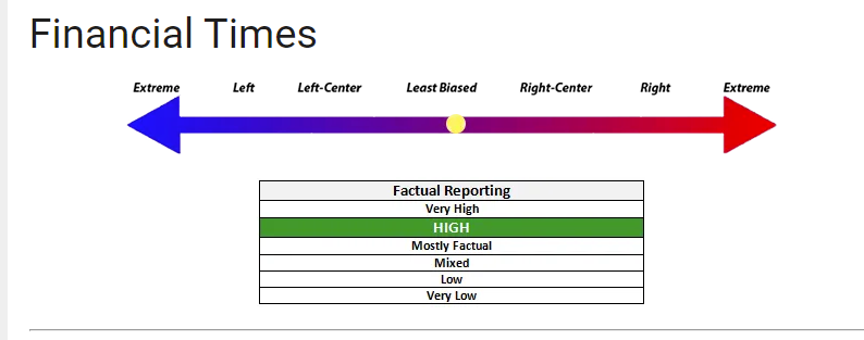
Stop posting anything from Media Bias Fact Check. You obviously cherry pick the shit out of that site.
LINK TO CHART BELOW
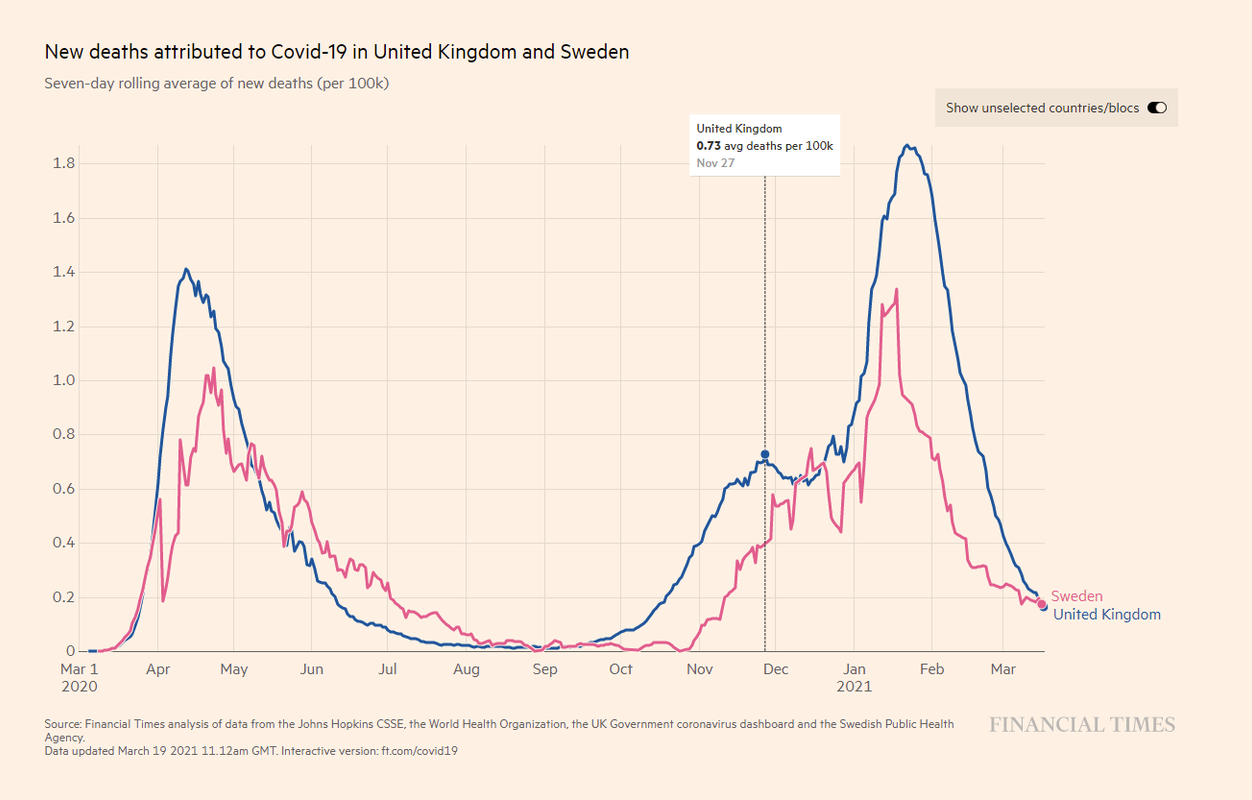
https://ig.ft.com/coronavirus-chart...&per100K=1&startDate=2020-03-01&values=deaths
Last edited: