fraudcurrents you no integrity liar.
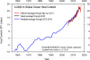
I told you I went to the NOAA data... picked the data set your team always uses to show global temps and set it to a monthly chart. It shows the same drop in temps.
You don't like the truth... this page provides the links you can go to the NOAA data center of the Hadley data center and NASA data and download and graph the data yourself.
you fraudcurrents are part of the the lowest forms of humans on the internet. One who is presented with truth and calls it a lie.
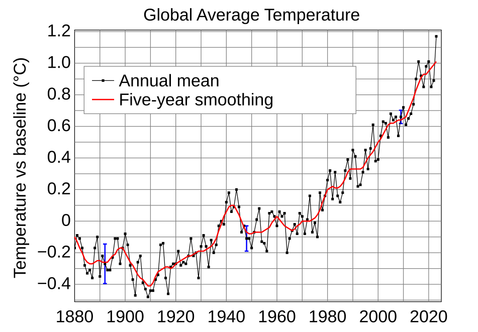
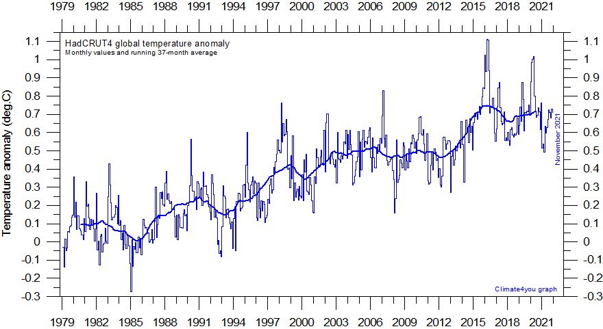
Global monthly average surface air temperature since 1979 according to Hadley CRUT, a cooperative effort between the Hadley Centre for Climate Prediction and Research and the University of East Anglia's Climatic Research Unit (CRU), UK. The thin line represents the monthly values, while the thick line is the simple running 37 month average, nearly corresponding to a running 3 yr average. An introduction to the dataset has been published by Brohan et al. (2005). Lower down the present page you will find a graph showing the entire series since 1850. Base period: 1961-1990. Last month shown: March 2018. Last diagram update: 1 May 2018.
- Click here to download the series of estimated HadCRUT4 global monthly surface air temperature anomalies since 1850.
- Click here or here to download the series of estimated HadCRUT3 global monthly surface air temperature anomalies since 1850.
- Click here to read a description of the data file format.
- Click here to see a maturity diagram for the HadCRUT data series.
- Click here to read about data smoothing.
- Click here to open a web interface to all the weather station data used by the Hadley Centre, a very useful facility developed by Clive Best, also known for his blog. Please note that the stations are split into 3 groups. 1) those going back to before 1860 2) Those going back to between 1860 and 1930 3) Those with data going back later than 1930. The last option is all stations together - but is very slow to load (>5000 stations). Drag a rectangle to zoom in. Click on a station to see the graph of temperatures and anomalies.
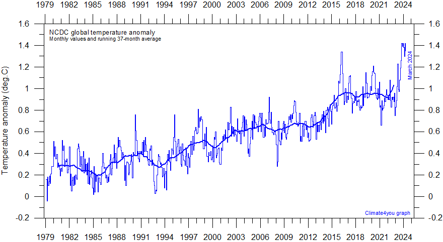
Global monthly average surface air temperature since 1979 according to the National Climatic Data Center (NCDC), USA. This time series is calculated using land surface data from the Global Historical Climatology Network (Version 2) and sea surface temperature anomalies from the United Kingdom MOHSST data set and the NCEP Optimum Interpolated SSTs (Version3; note version change on May 2, 2011). The thick line is the simple running 37 month average, nearly corresponding to a running 3 yr average. Base period: 1901-2000. Last month shown: March 2018. Last diagram update: 19 April 2018.
- Click here to download the series of the NCDC global monthly surface air temperature anomalies since 1880.
- Click here to see a maturity diagram for the NCDC data series.
- Click here to read about data smoothing.
sea surface temperature record. The overall result is to produce a record giving the impression of a continuous temperature increase, also in the 21st century. As the oceans cover about 71% of the entire surface of planet Earth, the effect of this administrative change is clearly seen in the NCDC record for global surface air temperature above.
May 2, 2011: NCDC transitioned to GHCN-M version 3 as the official land component of its global temperature monitoring efforts. GHCN-M version 2 mean temperature dataset will continue to be updated through May 30, 2011, but no support for this version of the dataset will be provided. The global anomalies using GHCN-M version 2 can be accessed here:
GHCN-M v2. The net effect of the change from version 2 to 3 can be seen
here.
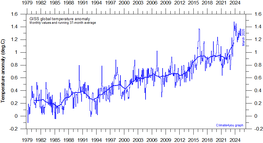
Global monthly average surface air temperature since 1979 according to the Goddard Institute for Space Studies (GISS), at ColumbiaUniversity, New York City, USA. GISS is a laboratory of the Earth-Sun Exploration Division of NASA's Goddard Space Flight Center and a unit of the Columbia University Earth Institute. The thick line is the simple running 37 month average, nearly corresponding to a running 3 yr average. Discussions of reasons why the GISS temperature estimate differs from other estimates can be read by clicking here, hereand here. Base period: 1951-1980. Last month shown: March 2018. Last diagram update: 18 April 2018.
- Click here to download the series of the GISS global monthly surface air temperature anomalies since 1880.
- Click here to see a maturity diagram for the GISS data series.
- Click here to read about data smoothing.
- Click here to download pre-version 3 (v.2) individual GISS station data.