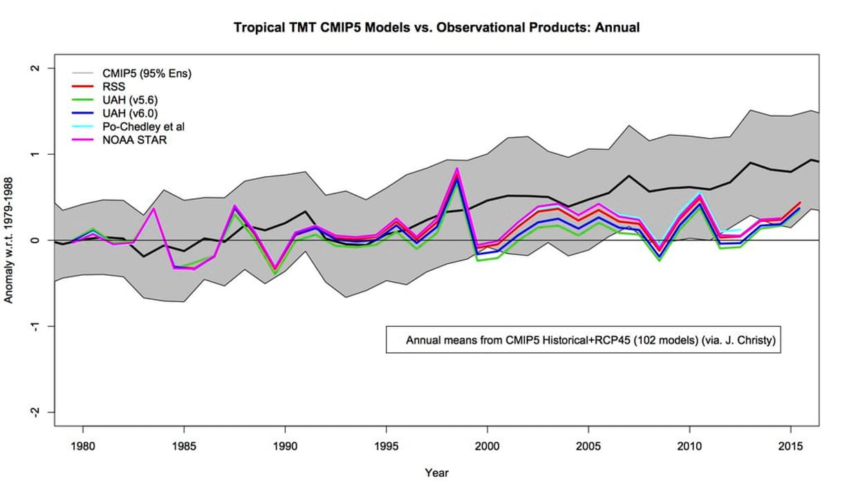
this is the 102 failed models... chart. this has nothing to do with hansens 1988 scare testimony in which his scenario A said by 2025 to 50 we would see 3 to 9 degrees of warming. (unless his model is off the chart.)

Same averages crap again without showing which data set he is using.
Here, detailed rebuttal
First, Christy “misleadingly misaligned” the starting point, using a single date instead of an averaged baseline. This has the effect of exaggerating the differences. Actual peer reviewed papers (as opposed to Christy’s misbegotten chart) show that when you use a scientifically respectable climatic baseline as your starting point instead of a single year, the result tells a very different story: one of model-observation agreement.

What a more honest comparison of models to observations looks like
Christy then fails to include uncertainty ranges in the chart, which is ironic given how deniers love citing scientific uncertainty as a reason for not addressing climate change. By showing only the average of model results and not the spread, Christy hides the fact that temperatures are doing exactly what many model runs would expect.
Similarly, by averaging together different observed temperature data sets (and not disclosing which ones he’s using in the first place), Christy hides the fact that the observational data is varied. Averaging the datasets makes it look like they're in close agreement, when in reality, satellite and weather ballon records have been drifting apart. Not to mention, Christy leaves out the actual thermometer-based record of land and ocean surface temperatures, which show more warming than the observational data in Christy’s chart.
That’s the fifth issue highlighted in Nuccitelli's article: Christy’s chart only shows air temperature data at 25,000 feet. It doesn't take a scientist to know that temperatures on Mount Everest, which peaks at 29,029 feet, are much colder than those at sea-level. And when it comes to measuring global climate change, you need to account for changes in temperature across the entire system, and not just those in the atmosphere. It so happens that the ocean stores 93 percent of heat added due to global warming!
All these problems with the chart should make it obvious why Christy’s never been able to publish it in peer-reviewed literature. To do that, he’d have to justify why he cherry-picked model runs and observation records, why he’s neglected to show uncertainty ranges, why he chose to use a single year instead of a baseline average, and why he thinks temperatures where life exists are less important for climate change concerns than temperatures at 25,000 feet.
Since he can’t do that, he’s left with presenting it in places where the facts don’t seem to matter much. Which, apparently, is Congress.
https://www.dailykos.com/story/2016...ong-With-This-Picture-Christy-s-Chart-Version