Hopes of mild climate change dashed by new research

https://www.nature.com/ngeo/journal/v10/n7/full/ngeo2973.html

Causes of differences in model and satellite tropospheric warming rates

In the early twenty-first century, satellite-derived tropospheric warming trends were generally smaller than trends estimated from a large multi-model ensemble. Because observations and coupled model simulations do not have the same phasing of natural internal variability, such decadal differences in simulated and observed warming rates invariably occur. Here we analyse global-mean tropospheric temperatures from satellites and climate model simulations to examine whether warming rate differences over the satellite era can be explained by internal climate variability alone. We find that in the last two decades of the twentieth century, differences between modelled and observed tropospheric temperature trends are broadly consistent with internal variability. Over most of the early twenty-first century, however, model tropospheric warming is substantially larger than observed; warming rate differences are generally outside the range of trends arising from internal variability. The probability that multi-decadal internal variability fully explains the asymmetry between the late twentieth and early twenty-first century results is low (between zero and about 9%). It is also unlikely that this asymmetry is due to the combined effects of internal variability and a model error in climate sensitivity. We conclude that model overestimation of tropospheric warming in the early twenty-first century is partly due to systematic deficiencies in some of the post-2000 external forcings used in the model simulations.
 
on its face that chart is ridiculous. we are talking about the models projections going forward from about the time they were made... til now and the near future.... not the past.

in fact you point out the problem most traders know about.
fitting your models to past data almost always results in broken models on real time data.


This is the dishonesty

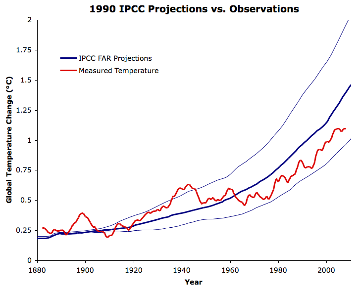
IPCC_FAR_Since_1880.png


Your guy averaged out three different scenarios instead of simply presenting them side by side. How can you average out three different scenarios and then call it honest.
 
on its face that chart is ridiculous. we are talking about the models projections going forward from about the time they were made... til now and the near future.... not the past.

in fact you point out the problem most traders know about.
fitting your models to past data almost always results in broken models on real time data.

You keep saying it's broken and yet the realized results are higher than the lowest projected scenario and closely match the best case year after year.

And why is that chart ridiculous, would it be better if they averaged out three DIFFERENT scenarios to make a disingenuous case. Do you average out your bollinger bands too when trading? How is that useful?
 
Emphasis mine below.

http://www.nature.com/news/global-warming-hiatus-debate-flares-up-again-1.19414

Researchers now argue that slowdown in warming was real.

An apparent slowing in the rise of global temperatures at the beginning of the twenty-first century, which is not explained by climate models, was referred to as a “hiatus” or a “pause” when first observed several years ago. Climate-change sceptics have used this as evidence that global warming has stopped. But in June last year, a study in Science claimed that the hiatus was just an artefact which vanishes when biases in temperature data are corrected1.

Now a prominent group of researchers is countering that claim, arguing in Nature Climate Change that even after correcting these biases the slowdown was real2.

“There is this mismatch between what the climate models are producing and what the observations are showing,” says lead author John Fyfe, a climate modeller at the Canadian Centre for Climate Modelling and Analysis in Victoria, British Columbia. “We can’t ignore it.”
 
you are now distracting your ass off...
you brought up the hansen testimony crap not me.
that has nothing to do with the failed models I cited.


Total BS.

They projected THREE scenarios - and your guy ignores the BEST case scenario and averages it out with the WORST case scenario to peddle his dishonest BS. Why not simply plot realized temperatures against the best case instead of peddling averages as if they make sense.[/QUOTE]
 
http://www.ec.gc.ca/scitech/default...e&formid=E5CBD879-6362-443E-AF8C-BC799B9F5797

John C. Fyfe
Senior Research Scientist - Global climate variability and climate change

Canadian Centre for Climate Modelling and Analysis (Victoria, BC)

AFFILIATIONS
Adjunct Professor, School of Earth and Ocean Sciences, University of Victoria

AWARDS / EDUCATION
B.Sc. Mathematics, University of Regina, Canada, 1982

Ph.D. Meteorology, McGill University, Canada, 1987

Postdoctoral Fellow, Princeton University, USA, 1987

Canadian Meteorology and Oceanography President's Prize, 2008

University of Victoria Craigdarroch Research Award (jointly awarded), 2008
 
you are now distracting your ass off...
you brought up the hansen testimony crap not me.
that has nothing to do with the failed models I cited.

Right, because when the realized results fit the best case scenario instead of an average of three DIFFERENT scenarios, it means the models are crap and not the people who are unable to understand how scenarios work.
 
this is the 102 failed models... chart. this has nothing to do with hansens 1988 scare testimony in which his scenario A said by 2025 to 50 we would see 3 to 9 degrees of warming. (unless his model is off the chart.)

modsvsobs.png
 
1499360936253


Top: The total daily contribution to the surface mass balance from the entire ice sheet (blue line, Gt/day). Bottom: The accumulated surface mass balance from September 1st to now (blue line, Gt) and the season 2011-12 (red) which had very high summer melt in Greenland. For comparison, the mean curve from the period 1981-2010 is shown (dark grey). The same calendar day in each of the 30 years (in the period 1981-2010) will have its own value. These differences from year to year are illustrated by the light grey band. For each calendar day, however, the lowest and highest values of the 30 years have been left out. Courtesy Danish Meteorological Institute
 
Back
Top