

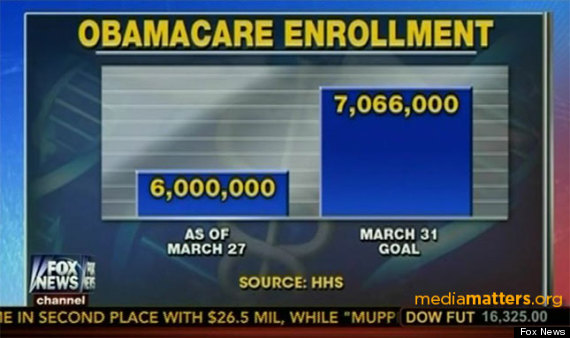
A Fox News graphic about Obamacare enrollment levels looked juuuuuust a bit off on Monday.
It showed a bar chart comparing the number of Obamacare enrollments as of March 27 â 6 million â to the original projection of 7 million by March 31 from the Congressional Budget Office. There was a slight problem with the way the network portrayed things, though, as Media Matters noted.
http://www.huffingtonpost.com/2014/03/31/fox-news-obamacare-graphic_n_5063582.html
