I'm going to post some charts on total death aggregate data from the CDC based on a thread I've been following on Twitter. This information is available on the CDC's website, and while not all Florida related, it is relevant for a discussion on deaths during the crisis in Florida.
Feel free to comment. Leave your stupid "DeSantis caused people to die" commentary at the door, please.
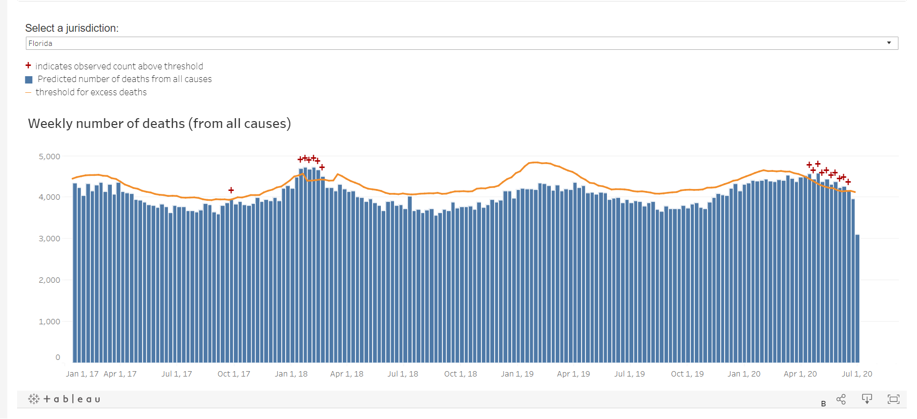
First, some technical background on the charts:
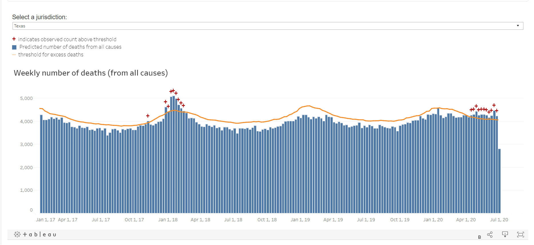
Estimates of excess deaths can provide information about the burden of mortality potentially related to the COVID-19 pandemic, including deaths that are directly or indirectly attributed to COVID-19. Excess deaths are typically defined as the difference between the observed numbers of deaths in specific time periods and expected numbers of deaths in the same time periods. This visualization provides weekly estimates of excess deaths by the jurisdiction in which the death occurred. Weekly counts of deaths are compared with historical trends to determine whether the number of deaths is significantly higher than expected.
FLORIDA - the incursion into "excess" deaths was quite small, and wasn't even as bad as the 2017 flu season. Remember that this is deaths from all cause, so as non-covid deaths decline, it acts as a counter to the covid incursion of deaths, as I understand it.
NEW JERSEY - which went into hyper lockdown mode. A significant spike into excess deaths.
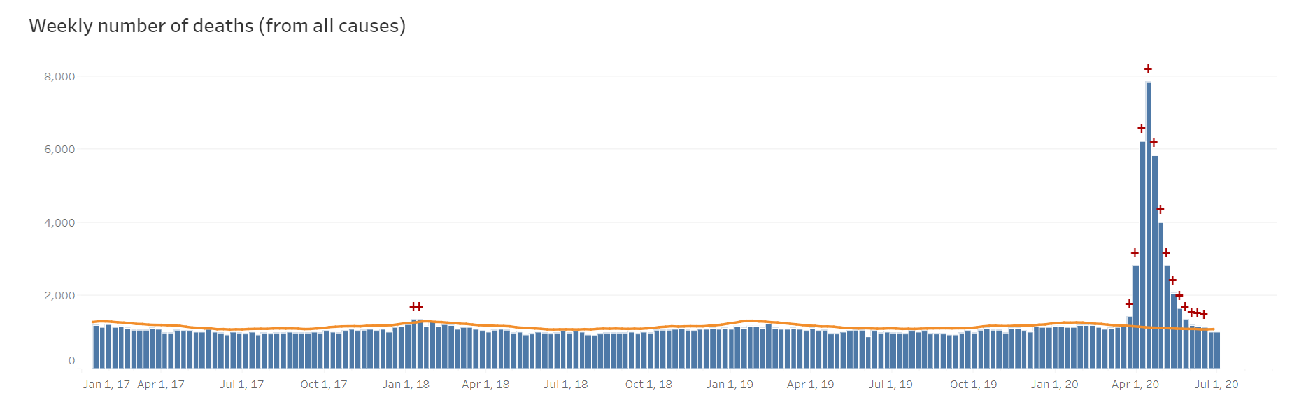
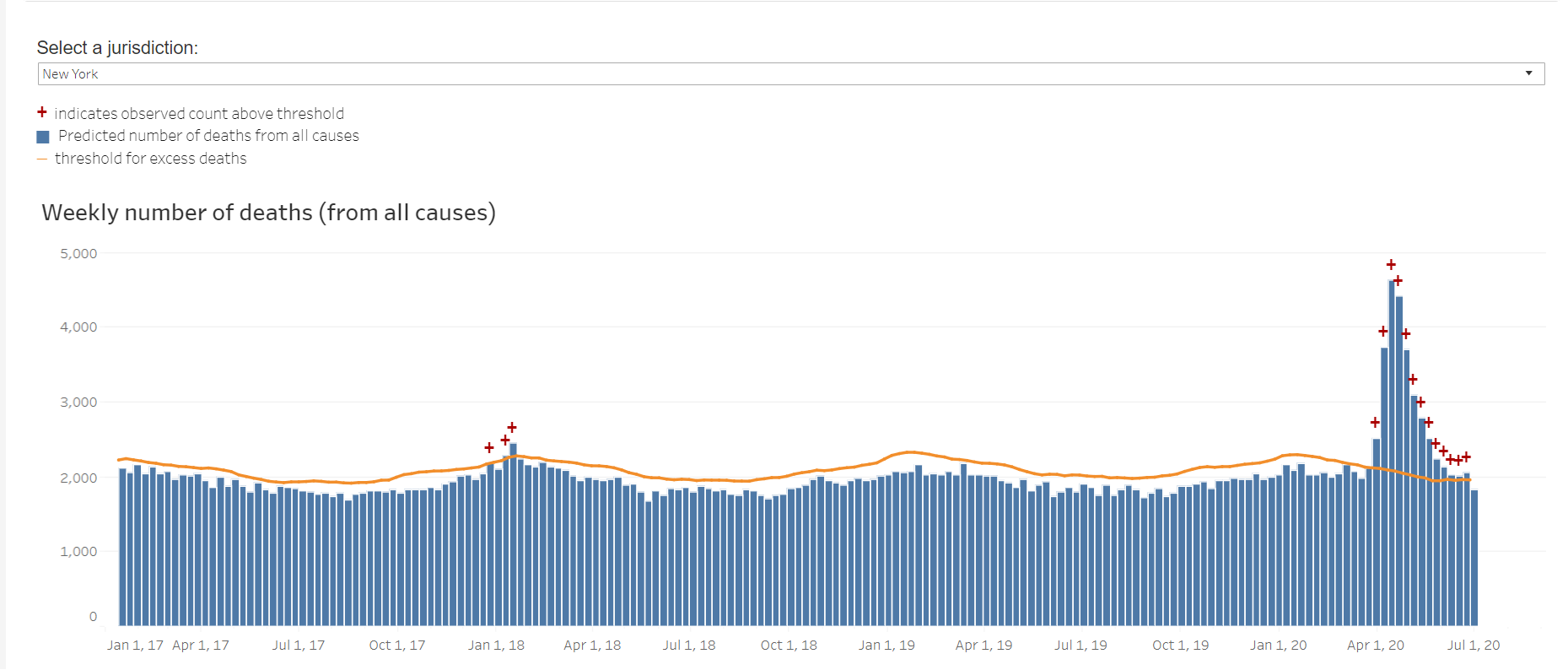
NY data is split by NYC and NY State. No idea why.
NY City
NY STATE ex City
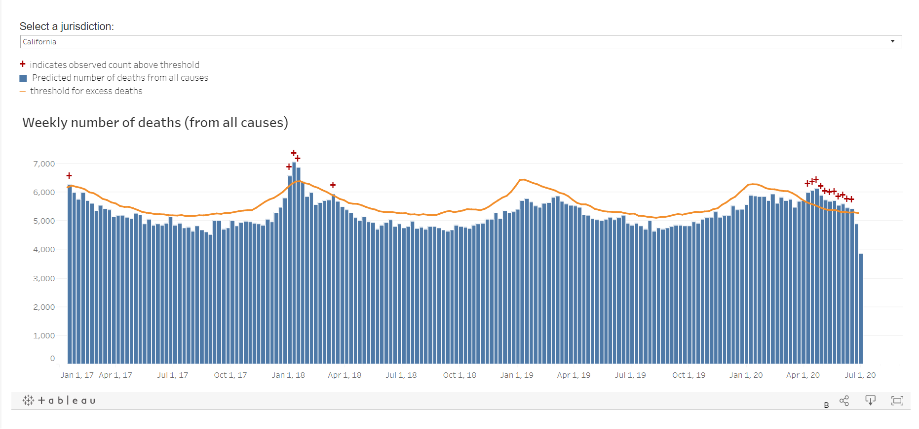
California slightly higher than the 2017 flu.
Texas high, but again, nothing like the 2017 FLU.
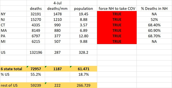
Chart from EL Gato Malo (twitter:
@boriquagato) showing that stats with 19% of the population represented
55% of the total deaths and that policy was designed around these results for the rest of the country. If NY and NJ were their own countries, they would rank 1 and 2 for the worst places on earth in terms of deaths per 1M pop (h/t
@boriquagato)