
You are using an out of date browser. It may not display this or other websites correctly.
You should upgrade or use an alternative browser.
You should upgrade or use an alternative browser.
Correction... 2015 was not the warmest year
- Thread starter jem
- Start date
1. your team uses tree ring proxies to develop you fudged hockey stick chart... and now you are arguing that we are liars for stating the satellite measurements of temperature don't show warming even though the are pretty much in agreement with the measurements of ocean temps and its a NASA .
How the fuck do you argue that the earth is losing ice? do you think the people are pulling out tap measures?
your integrity is so low it can't be measured.
Why do you have to be such a troll?
2. Climate model results summarized by the IPCC in their third assessment show overall good agreement with the satellite temperature record. In particular both models and satellite record show a global average warming trend for the troposphere (models range for TLT/T2LT 0.6 - 0.39 °C/decade; avg 0.2 °C/decade) and a cooling of the stratosphere (models range for TLS/T4 -0.7 - 0.08 °C/decade; avg -0.25 °C/decade).[41]
3. Here we see NOAA nasa altered the records you seem so proud of...
https://stevengoddard.wordpress.com...-altered-us-temperatures-after-the-year-2000/
4. George Orwell explained how this worked.
“He who controls the past controls the future. He who controls the present controls the past.”
― George Orwell, 1984
Just STFU, liar. It's beyond ridiculous at this point. Get help.
Just STFU, liar. It's beyond ridiculous at this point. Get help.
Are you just going to call people names or actually provide information that refutes the scientific points?
I guess you have nothing. Your bag of tricks and bullshiat is empty.
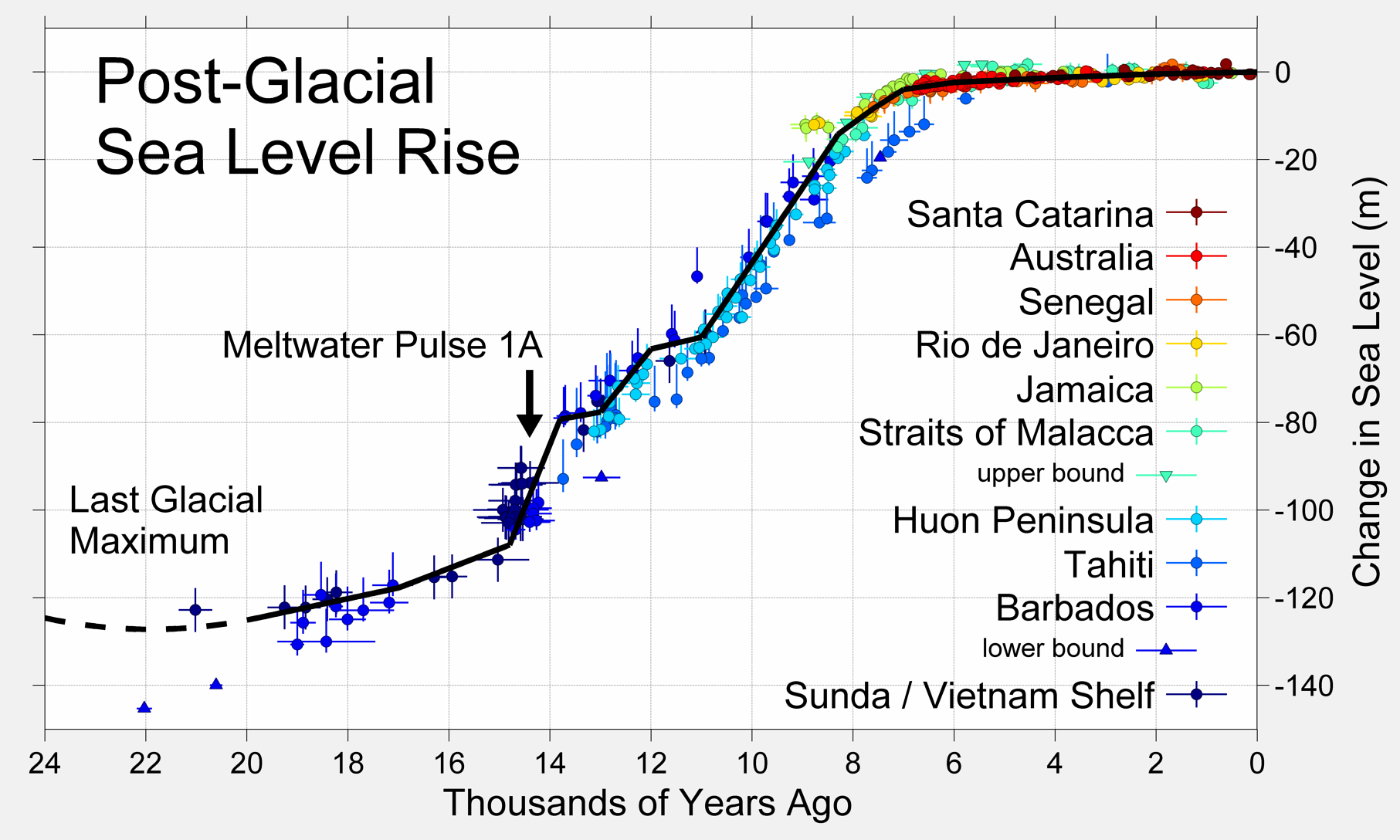
Seems an interesting chart. But I'd have to admit I don't quite understand the chart properly!
Perhaps a source/link would help.
Don't bother trying to. It's such a large scale, , low resolution chart that recent sea level is not resolvable.
It's just more deception/lies from him.
Measuring sea level is now a multidisciplinary effort involving integration of observations from several global networks of hundreds of tidal stations, calibrated with vertical reference data from nearby GPS (Global Positioning System, which now use the American GPS, Russian GLONASS and European Galileo constellations of satellites) or DORIS (Doppler Orbitography Integrated by Satellite) stations, and data from several independent satellite based radar altimeters (recently Jason I, Jason II, and Envisat) which give complete global coverage, data on sea temperature and pressure from the ARGO floating sensors (which give information on temperature and salinity related variations in Oceanic volume), and most recently data from the satellite based gravity sensor GRACE (Gravity Recovery And Climate Experiment), which can give direct measurements of changes in mass of oceanic and land based water.
A 2009 review by Merrifield et al of the GLOSS (Global Sea Level Observing System)gives some indication of the large number and variety of organizations and workers involved. These measurements are complementary as well as providing independent cross validation checks on any individual data set, and many teams independently process raw observations to derive sea level data. This has enormously improved our knowledge of estimated sea level rise at global and regional level over the past 20 years, with continual refinements of estimates, as well as reductions in uncertainties from the centimetric level to sub mm level.
What are the conclusions from these efforts? Recent reviews (Cazenave et al 2009,Cazenave and Llovel 2010) show that the most up to date estimates of mean rate of sea level rise for the 20th century are converging on around 1.7 to 1.8mm/year, with uncertainties of around 0.2 to 0.3mm. (Ablain 2009, Church 2008, Engelhart 2009,Jevrejeva 2008, Leulette 2009, Merrifield 2009, Woppelmann 2009). The small differences between reported figures are mainly due to the different Glacial-Isostatic Adjustment (GIA) model or GPS based corrections that are used for the tidal stations, and extrapolating current knowledge of these vertical velocity corrections backwards to before the absolute GPS corrected data was available.

Figure 1: Global corrected tidal station data (Church 2006 updated to 2009-dark blue, and Jevrejeva 2008- red)
Jem, Naturally I like this a lot, because it plays right into my personal biases. I have, as you know, long held on to the hypothesis, considered a bit wacky by some of the "experts", that direct heat release related to human activity is having a warming effect that is likely to be greater than what should be the small indirect warming from CO2's greenhouse effect. I find this data to be consistent with my hypothesis, and that makes me happy.I thought this was a interesting run down... of this situation.
http://euanmearns.com/the-diverging-surface-thermometer-and-satellite-temperature-records-again/
The Diverging Surface Thermometer and Satellite Temperature Records Again
Posted on September 18, 2015 by Euan Mearns
Joint post with Roger Andrews
In my recent post titled The Diverging Surface Thermometer and Satellite Temperature Records, Roger posted 4 charts in the comments that I felt were both interesting and important. For those not up to speed with the importance of comparing surface thermometer with satellite data it boils down to understanding the rate of global warming and whether or not the lower troposphere is still warming as all the climate models predict should be happening. The satellite data (UAH and RSS) shows little to no warming since 1997 – the famous pause – while all the surface thermometer records now show continued warming (e.g. GISS LOTI and HadCRUT4). One of the data sets must be faulty and Roger’s charts cast some further light on this issue.
Here we deal with the charts in the reverse order from Roger’s comment. Figure 1 compares the UAH satellite (over sea only) and Hadley sea surface temperature (HadSST3) records. HadSST3 makes up 71% of HadCRUT4, the combined land-ocean record commonly used to define the Earth’s ‘surface temperature’. The grey trace shows the difference between these two data sets and shows a near flat line. There is literally no difference between surface temperatures and temperatures measured by satellites over the oceans. This suggests that both these data sets are reliable.
Figure 1 Satellite over-sea temperature (UAH) compared with sea surface temperature (HadSST) data. The difference between the two is the grey trace at bottom which shows the gradient of satellite and surface data over oceans are the same.
This points to the faulty data lying in the land based data. Why should the satellites work reliably over the oceans and not over land? We can’t think of a reason. But there is a good reason for suspecting the land based thermometers since these measure temperatures in a totally different way to the SSTs. Roger has long argued that SST and air temperature data over land should not be combined into a single index since they are measuring different things.
If we do the same comparison over land we see there is a difference (Figure 2) with the land based Crutem4 index showing about 0.3˚C more warming than the UAH over-land data since 1980. One needs to recall that the difference between the gross satellite and surface data is tiny, of the order +0.15˚C since 1980. Since the land based data only accounts for 29% of the total, this difference between the land based data sets may account for about 0.09˚C of the gross difference, i.e. most of it.
Figure 2 Comparing the satellite data over land with the land surface thermometer data shows a small difference with the surface thermometers running about 0.3˚C warmer. Enough to explain most of the difference between the global satellite and surface indexes.
We can take this a step further. Comparing the UAH over-land and over-sea we find that the air over land does indeed appear to be warming marginally more rapidly than the oceans. I would feel inclined to put that down to non GHG related human activity such as urban sprawl, deforestation and irrigation.
Figure 3 Comparing satellite data over sea and over land suggests that the land may be warming slightly faster.
If we compare the surface records we see that the land is warming much faster than the oceans, of the order +0.5˚C since 1980. Does this mean that CO2 is a more potent GHG over land? We don’t think so. The different behaviour can be explained by either adjustments made to land surface thermometer records or by land surface thermometers being more sensitive to growing population and land surface changes than satellites. The thermometers are after all normally located close to human habitation.
Figure 4 Comparing the surface thermometer data over land and over sea suggests that the air over land is warming much faster than the oceans.
Finally, in the comments Luis pointed out that HadCRUT3 was largely in agreement with UAH since 1997. So I have checked this out.
Figure 5 Comparison of HadCRUT3, 4 and UAH since 1997. HadCRUT4 re-writes the record books. Note the offset between HadCRUT and UAH is down to different datum / base periods used.
It is indeed the case that since 1997, UAH has been on a flat, slowly declining trend (-0.13˚C per century). HadCRUT3 was on a flat, slowly rising trend (+0.18˚C per century). HadCRUT4 is on a much more steeply rising trend of +0.59˚C per century. With a stroke of the brush, the pause was written out of history.
Concluding Comment
Satellite and surface thermometer data agree over the oceans. They used to agree better over land until HadCRUT4 supplanted HadCRUT3, ending the pause and causing land surface thermometers to diverge from the satellite data sets.
Share this:


The reason the land temperature set (CRUT4 land) show a little greater warming than the satellite land data is that the satellite data is integrated over the entire land surface covered by the satellite sensors , whereas the CRUT4 data is mostly gathered from sites nearer human habitation and then "corrected", deleted, or otherwise tampered with to "adjust" for "urban island effects". Consequently, the Crut4 land data must be considered the least accurate.
Both the CRUT4 and the UAH-land data show more warming over land than sea. Warming, which is the difference over time, i.e., the gradient, should be the same over land and sea if rising CO2 is the dominant factor. (don't tell FC this, it would upset him.)
Key sttatements from your post :
"Satellite and surface thermometer data agree over the oceans. They used to agree better over land until HadCRUT4 supplanted HadCRUT3, ending the pause and causing land surface thermometers to diverge from the satellite data sets."
and,
"Roger has long argued that SST and air temperature data over land should not be combined into a single index since they are measuring different things."
Last edited:
Are you just going to call people names or actually provide information that refutes the scientific points?
I guess you have nothing. Your bag of tricks and bullshiat is empty.
It doesn't matter. I have shown you denier liars the science many times now. You have no desire to understand or restate the truth.
You denier liars are not interested in the truth. At all. Really, go fuck yourself.
But one more time for any sane logical objective truth seeking observers here.
https://en.wikipedia.org/wiki/Hockey_stick_controversy
Eight independent investigations of the allegations and the emails all found that there was no evidence of fraud or scientific misconduct by the scientists. One report, by the United States Environmental Protection Agency (EPA), considered detailed petitions raised by conservative activists and business groups with reference to the emails: the EPA examined every email and concluded that there was no merit to the claims in the petitions, which "routinely misunderstood the scientific issues", reached "faulty scientific conclusions", "resorted to hyperbole", and "often cherry-pick language that creates the suggestion or appearance of impropriety, without looking deeper into the issues."[211]
Jem, Naturally I like this a lot, because it plays right into my personal biases. I have, as you know, long held on to the hypothesis, considered a bit wacky by some of the "experts", that direct heat release related to human activity is having a warming effect that is likely to be greater than what should be the small indirect warming from CO2's greenhouse effect. I find this data to be consistent with my hypothesis, and that makes me happy.
The reason the land temperature set (CRUT4 land) show a little greater warming than the satellite land data is that the satellite data is integrated over the entire land surface covered by the satellite sensors , whereas the CRUT4 data is mostly gathered from sites nearer human habitation and then "corrected", deleted, or otherwise tampered with to "adjust" for "urban island effects". Consequently, the Crut4 land data must be considered the least accurate.
Both the CRUT4 and the UAH-land data show more warming over land than sea. Warming, which is the difference over time, should be the same over land and sea if rising CO2 is the dominant factor. (don't tell FC this, it would upset him.)
Of course you like it. You are a denier liar. No it should not be the same over land and sea. Once again you show breathtaking ignorance about some very basic stuff .
Oh wait, not ignorance, intentional deception and lying. I hope it pays you well.
you pre fascist big govt troll.
1. My chart illustrates that sea level has been rising since the last ice age. Does it not?
How therefore can you claim man made co2 is causing the rise? that is the point you fricken troll. You can't show sea level rise outside natural variation. for you not to be a troll liar here... you would have to produce science showing man made co2 is causing sea level rise beyond natural variation.
Go for it you low integrity pre fascist drone. Produce the science.... showing man made co2 is causing sea level rise.
2. You fricken troll you know damn well that change in ocean temps precede change in co2 levels. I have produced the charts and studies here many times. Every study shows it and no scientist denies it that we have found. At best the nutters say once temperatures start increasing co2 amplifies the warming... but that is unproven theory.
So there is almost no way given today's scientific understanding you can show the lagging variable is causing the leading variable.
You have no integrity, fc.
3. I see you are now referencing satellites. Do these satellites work as well as yardsticks while the other satellites deployed by the same groups do not work as well as the thermometers over land? you fricken troll.
4. note... you have the right to an opinion... but it is highly disgusting that you call us... the ones showing the science the lairs. if you keep calling us the liars... you are going to turn yourself into a sick demented old man. you can't be that twisted for long.
1. My chart illustrates that sea level has been rising since the last ice age. Does it not?
How therefore can you claim man made co2 is causing the rise? that is the point you fricken troll. You can't show sea level rise outside natural variation. for you not to be a troll liar here... you would have to produce science showing man made co2 is causing sea level rise beyond natural variation.
Go for it you low integrity pre fascist drone. Produce the science.... showing man made co2 is causing sea level rise.
2. You fricken troll you know damn well that change in ocean temps precede change in co2 levels. I have produced the charts and studies here many times. Every study shows it and no scientist denies it that we have found. At best the nutters say once temperatures start increasing co2 amplifies the warming... but that is unproven theory.
So there is almost no way given today's scientific understanding you can show the lagging variable is causing the leading variable.
You have no integrity, fc.
3. I see you are now referencing satellites. Do these satellites work as well as yardsticks while the other satellites deployed by the same groups do not work as well as the thermometers over land? you fricken troll.
4. note... you have the right to an opinion... but it is highly disgusting that you call us... the ones showing the science the lairs. if you keep calling us the liars... you are going to turn yourself into a sick demented old man. you can't be that twisted for long.
Don't bother trying to. It's such a large scale, , low resolution chart that recent sea level is not resolvable.
It's just more deception/lies from him.
Measuring sea level is now a multidisciplinary effort involving integration of observations from several global networks of hundreds of tidal stations, calibrated with vertical reference data from nearby GPS (Global Positioning System, which now use the American GPS, Russian GLONASS and European Galileo constellations of satellites) or DORIS (Doppler Orbitography Integrated by Satellite) stations, and data from several independent satellite based radar altimeters (recently Jason I, Jason II, and Envisat) which give complete global coverage, data on sea temperature and pressure from the ARGO floating sensors (which give information on temperature and salinity related variations in Oceanic volume), and most recently data from the satellite based gravity sensor GRACE (Gravity Recovery And Climate Experiment), which can give direct measurements of changes in mass of oceanic and land based water.
A 2009 review by Merrifield et al of the GLOSS (Global Sea Level Observing System)gives some indication of the large number and variety of organizations and workers involved. These measurements are complementary as well as providing independent cross validation checks on any individual data set, and many teams independently process raw observations to derive sea level data. This has enormously improved our knowledge of estimated sea level rise at global and regional level over the past 20 years, with continual refinements of estimates, as well as reductions in uncertainties from the centimetric level to sub mm level.
What are the conclusions from these efforts? Recent reviews (Cazenave et al 2009,Cazenave and Llovel 2010) show that the most up to date estimates of mean rate of sea level rise for the 20th century are converging on around 1.7 to 1.8mm/year, with uncertainties of around 0.2 to 0.3mm. (Ablain 2009, Church 2008, Engelhart 2009,Jevrejeva 2008, Leulette 2009, Merrifield 2009, Woppelmann 2009). The small differences between reported figures are mainly due to the different Glacial-Isostatic Adjustment (GIA) model or GPS based corrections that are used for the tidal stations, and extrapolating current knowledge of these vertical velocity corrections backwards to before the absolute GPS corrected data was available.
Figure 1: Global corrected tidal station data (Church 2006 updated to 2009-dark blue, and Jevrejeva 2008- red)
Of course you like it. You are a denier liar. No it should not be the same over land and sea. Once again you show breathtaking ignorance about some very basic stuff .
Oh wait, not ignorance, intentional deception and lying. I hope it pays you well.
Last edited:
Don't bother trying to.
Thanks. Same to you! Just let go!
Q
Scorched earth: at the epicentre of the Queensland drought, a family sells the last of their cattle
http://www.theguardian.com/environm...drought-a-family-sells-the-last-of-its-cattle

Penny Button, the owner of Crossmoor cattle property near Longreach, Queensland. For the first time in more than a century on the land, the family will fully ‘destock’ this week. Photograph: Joshua Robertson for the Guardian

A sheep skull lies at the edge of a dry dam on the property Rio Station in Longreach. Photograph: Lisa Maree Williams/Getty Images

A dam bottoms out on a cattle property in Longreach. Just 312mm of rain fell in Longreach in the 24 months to April 2015 – 64% below its long-term average. Photograph: Lisa Maree Williams/Getty Images
UQ
Scorched earth: at the epicentre of the Queensland drought, a family sells the last of their cattle
http://www.theguardian.com/environm...drought-a-family-sells-the-last-of-its-cattle
Penny Button, the owner of Crossmoor cattle property near Longreach, Queensland. For the first time in more than a century on the land, the family will fully ‘destock’ this week. Photograph: Joshua Robertson for the Guardian
A sheep skull lies at the edge of a dry dam on the property Rio Station in Longreach. Photograph: Lisa Maree Williams/Getty Images
A dam bottoms out on a cattle property in Longreach. Just 312mm of rain fell in Longreach in the 24 months to April 2015 – 64% below its long-term average. Photograph: Lisa Maree Williams/Getty Images
UQ