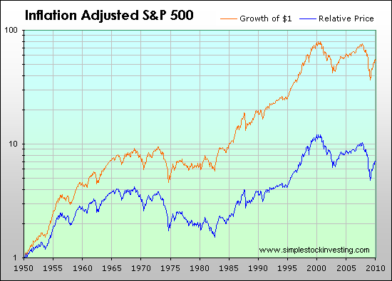
M makloda Jul 5, 2008 #11 Found this SP500 chart regarding the impact of both CPI and reinvesting dividends. Compounding of total returns, even after CPI, still makes a big difference: (Orange = total return, blue = price return)
Found this SP500 chart regarding the impact of both CPI and reinvesting dividends. Compounding of total returns, even after CPI, still makes a big difference: (Orange = total return, blue = price return)