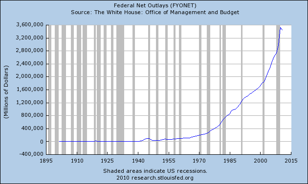
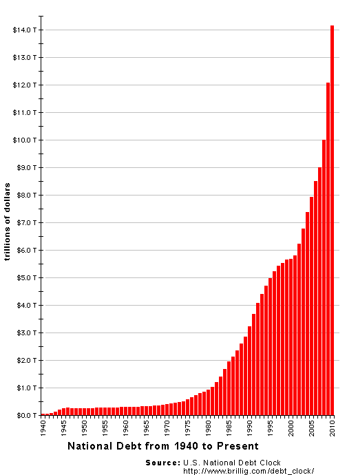
10 Economic Charts That Will Blow Your Mind

1. US Gov Spending

Chart-Federal-Net-Outlays.png


2. US Gov Debt

US_National_Debt_Chart_2010.gif


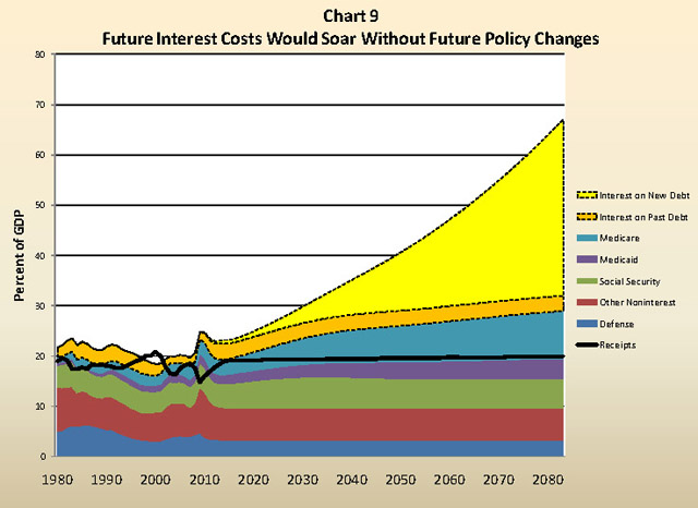
3. US Gov Interest Costs (Projected)

Interest-On-The-National-Debt-Of-The-United-States.jpg


4. US Household Debt
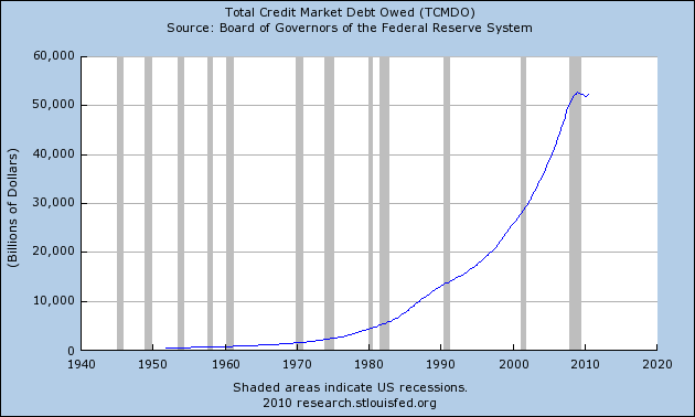
Chart-Household-Debt.png


5. US Total Debt

Total-Credit-Market-Debt-Owed.png


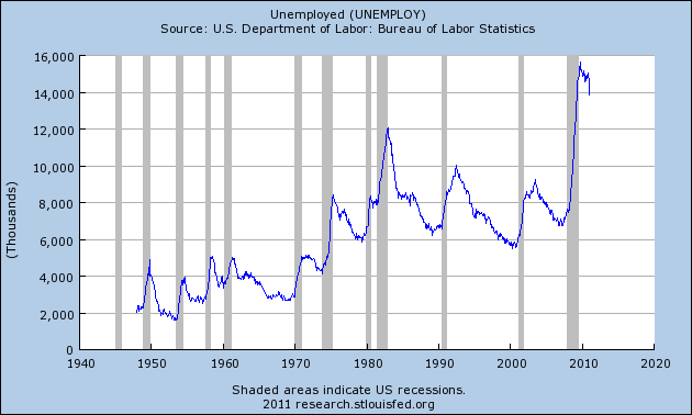
6. US Number of Unemployed Workers

Chart-Unemployed.png


http://theeconomiccollapseblog.com/...e-10-economic-charts-that-will-blow-your-mind
 
Quote from T_Geithner:

Chart No.3 actually shows that all the other charts are going to look even more fucked up 10 years down the road

Things are not hard to understand.

Soviet Union spent itself into death.

Money for Dark Empire came first till there was no more.


United States is maintaining empire of 2 wars, 1 giant cold war, 500 and more military bases around the world.
Mooony is running out boss.

Moony is running out
 
Quote from The RainMaker:

Please don't use a word that you can't write and understand...

That was a joke you flatfoot, intentional misspell

Go back to your country of origin :D
 
the thing about all this spending is that the decision makers uses other people's money, and spend on stuffs that benefits the themselves

sort of like managed funds, one fund manager i knew a Phd actually makes a shocking statement that its ok when she has losses in her fund since its not her money
 
Back
Top