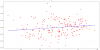
I'm a little confused on what exactly I'm seeing in picrel. Y axis is profit, X axis in the indicator. Is what's being shown that the higher the indicators value, the higher the likelihood of profit? Or am I going about this wrong way? This just seems like it's too simple. Although, I was expecting it to show the opposite.